WEBSITE DESIGN & DIGITAL MARKETING

Menu
Email me when new posts are made to this blog

Formatting with Zeald CMS

Written by Sarah Gleeson on November 12th, 2014.      2 comments

After working hard on the design of your website, you want to ensure it is looking its best. An easy way to do this, is to make sure your text is formatted properly. Having had your website designed by Zeald, our designers will have worked hard to create a branding guide for your text. This means, that you have a text style in your website's CMS that is just right for your brand.

Benefits of formatting your text:

  • Zeald designers have created a look that is just right for your brand, and designed to look good on your website.
  • Formatting your text ensures your website looks clean.
  • You are able to manage how your text is positioned on the page, and where everything should sit.
  • The ability to keep all your text consistent across your website.

In this video, we show you how easy and quick it is to format your text. 

If you have any questions,  call our Support team on 0508 932 748 ext 1. Comment below if there is something you would like us to cover off in the next video!


Why your small business needs landing pages

Written by Sarah Gleeson on September 10th, 2014.      0 comments

What is a landing page?

A landing page is a website page, which only has one function: to create leads via a form.

A home page that has a form on it is NOT a landing page, but a web page that’s only point is to have a form on it to gather visitors information IS a landing page.  

This is because a homepage has many more purposes than purely gathering information through a form.

Landing-page- why-you-need-one

Why should you have landing pages?

Landing pages are specific; they only have a form, and one call to action. Because of this, visitors are unlikely to get distracted and click on something else. It is a sure-fire way to generate leads efficiently.

They are also a quick and easy way to direct potential leads to complete a call to action.

For example, a company who is advertising their products or services will have a call to action which asks people to enquire about their service, or buy their product. This call to action would then be linked so that if clicked on, it would take the visitor directly to a landing page whose only goal is to complete the conversion by taking their information. 

web pages and landingpages

Click here to see an example of Zeald's Audit landing page.


Habits of ecommerce customers that you can benefit from

Written by Sarah Gleeson on August 12th, 2014.      0 comments

1. Buying products that have celebrity endorsements

It is common for people to be interested in products that their role models promote. This is especially strong when it seems natural that the celebrity would use the product themselves. For example, it would seem natural for wild-man survivalist, Bear Grylls to use a knife he promoted, compared to him eating at a fast food chain he promoted.  

Do you have a product that you know a customer uses? Write a blog about it, or post it on social media! For example, if you own a kids retail shop, and know that a celebrity mum uses a brand that you sell, let people know! You will most certainly catch the attention of customers who are a fan of the celebrity. 

bear grylls Topgear Zeald

2. Spending more to get free shipping

We’ve all been there, we have $25 worth of product in our cart, but free shipping is offered if you spend $30. What do you do? Some people will hunt around to find small something to bring their basket up to $30. Whereas other people may find your free shipping offer to be just the justification to spurge on the other product they were initially undecided on.

Because of this, you may want to consider the benefits of offering free shipping once a certain cart price has been reached. It is a great way to incentivise customers to spend that little bit more, without losing them to high shipping costs.

3. Spending more to save more

Offering a discount on one item because a customer has bought a number of other products encourages people to 'spend more to save more'. I have to admit, that while I know what shops are doing, I often fall for this. When you are already choosing between a few products, it does not take much for a company to grant you the permission you are internally looking for.  

Look to add this sales technique to your website seasonally when you are looking to get rid of excess stock, and to create hype via email marketing and social media when you do.

Want help


It’s all in the detail.

Written by Emily Wilson on July 29th, 2014.      1 comments

online productsYour product pages on your website are extremely important in converting visitors to your site, into customers. In order to make purchasing decisions, you need to provide as much information as possible to your potential customer. This includes multiple product views, detailed descriptions and delivery information. Think of your customer when designing your product page. You need to answer their questions before they’ve even asked them and alleviate purchasing anxiety. Do not let them become frustrated with your website or lack of detail and turn to a competitor to complete their purchase.

Some of the information you need to include on product pages are:

  • What does it look like from the back? Images are the first impression of your product. You need to draw the customer in using a great image. Then you need to provide multiple views of the product – the customer should be able to see it at all angles as-if they were rotating it in their hand. Show a stand-alone shot of the image as-well-as it being used in context – eg a model wearing the garment or a vase with flowers in it.
  • What do others think? Allow your products to be peer-reviewed. Have a great rating system and even a statistic available so shoppers can see at a glance what others think of it over all; such as 95% of customers rate this product 4/5 stars. Any bad reviews will allow you to address the problem and/or remove the product if unsatisfactory.
  • May I suggest…? Based on what they are buying or purchase history, suggest other products shoppers might like. This can increase your average order amount.
  • Is it in my size? Have a sizing chart to reduce returns on an item.
  • Is shipping extra? Be up-front about shipping. You could include a tally in a pop-out checkout that shows them how much more they need to spend to get free shipping. Do you have pick-up options? Unexpected shipping costs are one of the most common reasons for cart abandonment.
  • Does this include…? Finally be detailed in your description of the product. Give specifications and ingredients lists. Describe how you use the product, even how you can pair the product with another product and cross-sell.
help
 

All you need to know about inbound links

Written by Sarah Gleeson on July 11th, 2014.      0 comments

Link building is hard work, when done right. You don't want to resort to creating spam links. It is about continual updates, to keep content fresh and share worthy. 

Inbound links, also called back links, are valuable for any website. These are the links that come to your website from a different website. For example, if your business was a sports shop, a local rugby club website may link to your website to show their members where to buy their uniform. 

Why are they important?

Inbound links act as a direct pathway to your website. This means that a whole new audience can now find your website with ease. The amount of visitors that come through that link, depends on how much traffic the initial source receives.   

Another benefit of inbound links is that they serve to increase your SEO.

SEO (Search Engine Optimisation) is how well your website displays in a search engines unpaid results. To get more traffic, it is better to appear in the first page of results, as close to the top as possible. 

The more inbound links your website has, the more likely that your website will rank higher in search engines. This is because the inbound links are effectively telling the search engine that your website is trustworthy. Search engines (like Google) take this into account when ranking websites. 

However, not all inbound links are weighted the same. So it is not wise to create a bunch of spam websites to link to your website. 

Inbound links from other trustworthy websites are weighed much higher than inbound links from low ranked websites. For instance, an inbound link from Kings Plant Barn will be weighted higher than a small garden shop website whose website has not had any new content for years. 

Natural linking

It is important to ensure any inbound link seems natural. This means that the link should ideally be used as part of a sentence. This can easily be done with the use of a hyperlink. E.g. "Anthony’s Sports Shoes in Albany has a fantastic range of rugby shoes fit for any age this winter."

By placing a link within a sentence, customers are more likely to click on it. People are less likely to click on a link if it is just a URL, let alone a URL that they have to copy and paste into their browser. 

How to get inbound links

Since inbound links come from other websites, it can seem difficult to know how to get them. The best trick to get inbound links, is to have great content that people want to share with their audience. From there, you want to ensure people can find your content easily. This means, placing your content where your target audience is. Social media sites like Facebook and Twitter allow for immediate sharing, as well as related forums. Another fantastic idea, is to add your content to your email marketing and newsletters. 

Here are my top 5 ways to get inbound links:

  1. Create a blog 

    This is a great resource for getting original content out infront of people. What does your audience want to know about? What are problems they might be facing? Create blogs centered around their needs, this will not only ensure people come back to read your articles, but they are more likely to share your link to likeminded people. Make sure you send out your blogs to your customer database, or on social media to ensure more people see them. 

  2. Guest blog

    Guest blogging is where you create content for another website. This means that you able to talk directely to another websites' audience. Not only that, but you can direct the audience to your website for more information. For instance, a landscaping company could write up a blog for a gardening website, on the top new trends for utilising space. 

  3. Write case studies

    Case studies are a fantastic opportunity to promote your business without a heavy sales pitch. Find a client of yours who is happy to talk about their experience with your product or service. Any case study that makes your client or customer's business look good, will be sure to be shared by them too. Make sure you put your case studies on your website and on social media platforms too!

  4. PR

    Is your organisation doing something fantastic in the community? Why not write into your local newspaper with a story! Online articles best for SEO, but even a paper only version means that you get more brand awareness. Most newspapers have great SEO because of their rich content, so having them link their online articles to your website is sure to result in a heavy weighted link. 

  5. Create informative or fun videos

    Vidoes are one of the top shared types of content. Does your company have an upbeat personality? If so, create a video about your product/service, or team. If your business has more of a serious personality, why not create an informative video? Bunnings Warehouse creates fantastic DIY videos that are a huge hit with DIY rookies. 

Take home message:

Create new fresh content whenever possible. Post your own articles on social media platforms and in relevant forums. But resist spamming people, only post what you think is valuable and relevant to your audience.  


Want help
 

Testing, testing, 1, 2, 3.

Written by Emily Wilson on June 19th, 2014.      0 comments

testingOn a daily basis, Zeald customers are adding new products to their stores, setting up email campaigns, changing forms, creating coupons, writing blog posts, and so on. However, an often overlooked step in the process is testing.

Testing is a fundamental part of having a website. It pays to set aside some time on a regular basis to test your main conversion pathways, so you can catch a bug before your customers do.

What should I be testing?

You want your customers to have a positive experience and return again. Not testing your website can cause a lot of frustration. It is important to check any change you make before running with it. We have developed a testing checklist for you to run through.
 

  • Conversion Pathway

You should think about your main conversion pathways and test these on a regular basis, across the main browsers (Google Chrome, Mozilla Firefox, Internet Explorer, Safari). Does the link work? Does the form work? Does the shopping cart work? Test as a customer (front end) and as yourself (back end), meaning can you easily purchase a product or fill in an enquiry form as a customer would and receive confirmation emails; do you receive the notification of these orders/enquiries so you can then process them?

For instance... making your website live without testing your enquiry link and email address, so when a customer clicks on the link to email you, the email goes nowhere. This could result in numerous enquiries going unanswered.
 

  • New Software

If you are about to launch a new software development, you should also assist with testing as per the checklist. New software also goes through a two-phase process of alpha and beta testing during development:

  1. Alpha with internal testing - You the client goes through the conversion pathway - The alpha is what is presented at the launch plan.
  2. Beta is deploying / announcing with just a select few of your customers - guinea pigs before a full blown email out to all your customers.New features/ Upgrades/Downgrades

Basically if you change something you should test it.

Imagine if you changed the price on a product and didn't test to see what your customers see. You could end up selling a product at the wrong price, before the mistake is noticed.
 

  • Coupons

Check to see if the coupons work, test them on excluded products and after expiry date too (change the date settings on your computer.)
 

  • Email Marketing/Newsletters

Test links. Check send times and dates. Check the subject line. How does your email look in different email programs? Test in Outlook, Gmail, Yahoo! Mail, Hotmail, Thunderbird. How does your email look in popular email devices? Are there any spelling errors?

A company is able to set up a draft email marketing campaign for a future date, using it to edit and craft their ideas. Unfortunately, they may forget that it is still there when the date comes around. In doing so, an email would be sent out with outdated info, prices, offers, and spelling errors.

Testing is second nature at Zeald, we ensure that every element on the website, and every item that we send out, has been tested and viewed by multiple people. This increases our chance of catching any errors. 
 

Test checklist:

Pathway Testing

Email Testing

Software Testing

  • FRONT END: Visit landing page/homepage
  • Is your call to action compelling?
  • Click button/link
  • Fill in form / add product to cart
  • Submit form / go to checkout & purchase product
  • eCommerce: was the payment process smooth?
  • Did you receive a thank you page / Order confirmation?
  • Did you receive a confirmation email?
  • BACK END: Did you receive notice of the enquiry / order?
  • Are you able to process the order?
  • Email content created
  • Check spelling for errors
  • Have someone else check spelling
  • Send to yourself.
  • Check your subject line. Is it compelling?
  • Check design spacing
  • Are the images displaying?
  • Do the images fit the width of your email?
  • Check every link
  • Check email on different email clients.
  • Check display on mobile
  • Periodically check future dated emails for any test sends.
  • Software developed
  • Minimum Viable Product deployed
  • Alpha testing
  • Test as your customer uses and as you receive
  • Run your conversion pathway
  • Test on different browsers
  • Does it work? What is broken? Does it need to be fixed?
  • Report back bugs
  • Beta testing
  • Email link to select clients, friends, family for testing
  • Repeat process using real clients as guinea pigs


How to produce high quality product photos

Written by Sarah Gleeson on June 11th, 2014.      0 comments

In 2008, we wrote an article on how to produce high quality product photos. If you would like to view that article, click here

The below infographic has combined recent information on producing product photos, with the basics.

Produce high quality product photos

Want help
Topics: Web Design Tips
 

meet the experts: part two with Loretta Jean, Website Designer

Written by Sarah Gleeson on March 3rd, 2014.      0 comments

In 'meet the experts' part one, Loretta walked us through her predictions for web design in 2014. This time, Loretta shares her views on typography, scrolling websites, user experience, and how to know when your website needs a redesign.

Typography 

Typography put simply is the arrangement of type on a website. From far away it looks like blocks of content, but up close you can see the intricate detail and thought behind the type. There are some great examples out there of websites that use typography in place of images. Generally, we choose typography when imagery in the field is overused. Loretta believes that the use of quality type can add a “clean and slick effect to the overall look”. When asked why typography has seen a boost in popularity, Loretta says, “I think there is a general trend toward type in a lot of things, I instantly think of those ‘Keep Calm and Carry On’ posters everywhere”.

Looking to the year ahead, Loretta hopes that more businesses start to see the appeal of typography, "it is a great way to get across your message quickly, without cluttering up too much space."
 

Natural-Flow typography

Scrolling websites

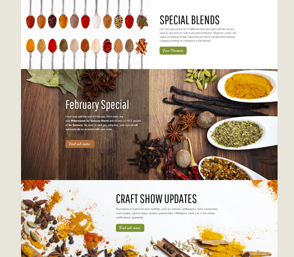
Scrolling websites, also known as long form design are a great way to establish a hierarchy through your landing page. By doing this, you are creating a clear pathway, guiding your customers past specific content so they will click through to the next page. This is also a great way to answer any unasked questions as they scroll.
  
An added benefit of using a long form design is that your content is better able to breathe, and stand out. This is a great opportunity to show off images, and play around with different type and blocks of content.  
 
Loretta says that while she hopes more people will consider using a long form design in 2014, she hopes they also begin to merge with the Windows grid look. Loretta’s final thought on scrolling websites; “Overall, it’s a relatively versatile structure that is clean and modern”. 

Italy Mask Redesign

User Experience

User experience is one of the most important factors a web designer and client have to discuss when designing a new website. “It's really easy to get caught up in a pretty design, but like any creative work, there will be someone interacting with it on the other end- if you don't factor your target customer in, then I think the design loses its purpose. People will most likely just shut down if things are a bit too out-there.” 

Redesigns 

When it comes to your website, 
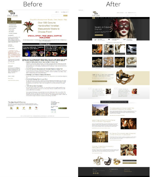
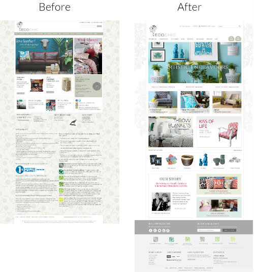
what looked great 5 years ago may look dated today. Because most people view their website on a day to day basis, it can be hard to review it with fresh eyes. Loretta suggests viewing other websites in your industry, taking special note of widths and lengths of the sites, and the amount of copy vs. images. Does your website stand out in comparison? Does it make enough of an impact to make a customer want to come back? Is it memorable? 
 
The impact of having an out of date website can be huge. Many customers may give up if it takes too long to load, or if it is hard to navigate. Loretta states, if the content has not been changed up in awhile, or the testimonials have not been refreshed, it can make the customer “question the credibility of your business”. 
 
What a redesign can do for a website is to give it a new fresh feel. You wouldn’t wear the same clothes for 10 years, so why should your website have to? Advances in technology and design continuously push the envelope in website design, “What can be achieved today is much different from 4-5 years ago”. You want your website to stand out, be memorable, and to keep people coming back. When customers are scrolling through multiple websites at a time, it can be hard to capture their attention. A redesign can help your website achieve that point of difference that will end the customers search.
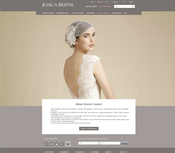
ecochic


A picture paints a thousand words

Written by Sarah Gleeson on February 19th, 2014.      0 comments

The utilisation of beautiful imagery can really bring the wow factor to any website. Images are being used more and more as a communication tool to the audience. Instead of using a lot of text which the reader may glaze over, the use of images helps to break up the text. Not only that but images can be used to bring across a strong message which may be difficult to communicate with just text. For example, what better way to show you have unique, beautiful wedding dresses, then to show it? 

Our web designers have commented that 2014 is the year that big, stunning images will be favoured over text as the preferred choice of content. So we have put together a few examples of websites that use stunning imagery. 


Jessica Bridal shows us the impact of a truly beautiful image. This understated look communicates the effortless elegance every woman wants to feel on her big day. 

Jessica Bridal website by Zeald

This look from Herbsonline is spectacular. Food is an experience for the senses, these images feed the reader the idea that what looks great will taste amazing. 

Herbsonline

Zlato Jewellers is another great example of a website that communicates its excellence in design and beauty, by showing instead of telling. Buying an expensive piece is an experience, and that experience needs to be there from the start.  

Zlato

Ecochic lets the customer envisage the products in their own home. By showing good quality, beautiful images, the customer gets a good feel for the potential new look their own home could have.

ecochic website design by Zeald
Topics: Web Design Tips
 

meet the experts: website design with loretta jean

Written by Sarah Gleeson on January 29th, 2014.      0 comments

part one of two: web designs in 2014. zeald designer, loretta jean, talks about her expectations of the year ahead as part of our meet the experts series.

Loretta webdesigner

Loretta Jean, has always been drawn to creative pursuits throughout her life. Studying in both New Zealand and Hawaii, she was lucky enough to be amongst inspiring landscapes, cultures, and people. Becoming a web designer was a natural path for Loretta, she loves being able to receive a logo from a client, and turn it into a website.

Looking back on the past year, Loretta talks about web design as being clever, “…the designs and functionality are getting more and more detailed, yet often look simple and clean”.

2014 looks to be a great year for new exciting web design trends blending with classic favourite concepts. Loretta looks forward to the year ahead, declaring: “everything in a website is getting bigger! Big juicy images, big chunky font, and big white spaces that allow the content to breathe”. Responsive Design also looks to be growing in popularity with more and more people choosing their phone after a long day sitting at a desktop.

responsive design = better results

responsive designResponsive design is often more minimal or slick in its design than other desktop websites. The design is also more functional as loading time is optimised and the design does not include any non-mobile phone compatible effects. All in all, it is a design that encourages minimal effort from the user, who is still able to gather the same amount of information as if they were on a computer, they are not left frustrated, which leads to greater engagement. The fact that anyone, anywhere at anytime can find your website, only improves results.

Results driven design is something which Zeald focuses on heavily. "We pride ourselves on delivering beautiful websites that generate results for our clients", Loretta declares. In terms of design, this can mean having the important components that people expect to see in web pages, actually there. Take for example a site that is built for mobile only where the expected header or footer is removed, this can leave your user frustrated and “severely impact on results”.

On top of having a great looking website that produces results, it is important to make sure the website is unique, and not similar to everything else out there, “a good designer will take into account the audience, the users, and push the boundaries where they ought to”. Being able to produce a website like this, the Zeald team follows standard web practice and keeps up with the latest design trends. This means keeping an eye on web design publications, and continuously looking for new inspiration to keep designs looking unique and fresh.

keeping it simple

Quality content is the cornerstone on which Zeald build websites. Things have changed since content was merely text on a screen; Loretta believes the best way to get a message across is through great imagery. However, she warns people off using cliche stock photos as they can look both contrived, and you run the risk of the image being on your competitors site too; “when users see the same image on your site that is on your competitors, it doesn’t make your site look unique or different”.

The Windows grid look is one of the key trends hitting 2014. This look comes from the Windows programs which show blocks with different content or links. The purpose of this design trend is to create a clean look which holds all the content in its own component. We often hear web designers talking about simple designs; to the uninitiated, simple can sometimes suggest a plain design. Plain is more often a lack of details on the website itself, leading to a boring end finish, “a white site with boring font and blocky images, … a non-memorable site”. In contrast, a simple design creates a user friendly atmosphere so the content can stand out. 


While Loretta loves this trend from a design perspective, she is wary about its crossover with Long Form design. In Long Form Design, the website encourages customers to keep scrolling down a page, to find out more information. So while Loretta gives long form the thumbs up, she encourages clients to proceed with caution when making changes; “It’s a look that often needs a designer to keep the website looking good”. 

Stay tuned for part two, where Loretta talks more about new design trends, and how to know when your website needs a makeover.


The importance of proportions in your images

Written by on October 2nd, 2013.      0 comments

When prospective clients visit your website they want to see good quality images of your products or services. The aim is to keep them flicking through your website, so they are more inclined to buy from you. 

So when you are uploading images for your website, it is important that you take the time to make sure they are perfect. Part of this is ensuring that your proportions are the same. This is important because you want all your product images to display the same way, especially if they are in a line next to each other. Images that are different sizes all over your website, can be distracting to a prospective client who wants to compare products and services. You want to make sure clients are paying attention to the content and images, not getting annoyed by the varying image sizes for products. 

Due to the large number of products your website can potentially host and display, it is important that you correctly manage product images.

It is important that you keep the size of your product images consistent - i.e. that all your image's proportions are identical. The main reason for this, is that when your product images are displayed, both when viewing product categories, or a specific product, they display with a fixed width. This means that a long, skinny image will display much larger than a short, wide image even if they are of similar resolutions. 

pencil comparisson of image proportions

As can be seen above, the second image is displaying smaller, due to the proportions being different (height being low, when compared to the image's width), even though the images are the same resolution. (One is 500x100px, the other is 100x500px) This can be avoided by making sure all your product images have the same proportions as one another.

The easiest way to ensure your images are all of the same proportions, is to take them all on the same camera, and do not crop them before or after uploading them. 

If you do need to use images that are of different proportions, your best course of action is to crop these images to be the same proportion as your standard images.

Determining the desired proportions

  1. Find a product image that you are pleased with the way it is displaying.
  2. Open this image in the image manager by clicking on it in the product page of that product in the website manager and click edit.
  3. Then click Adjustments > Crop. Take a note of the height and the width of this image. Close the image editor without saving your changes.
How to get desired proportions in your images

The dimensions of this image are 330px x 250px. These values will give you the desired proportions of your product images.

Cropping images to your desired proportions

Once you have found your desired proportions, you can begin cropping your other product images to these same proportions. You can do this prior to importing them, using an image editing program, such as Photoshop, or free alternatives.

If your images have already been uploaded, you can perform these edits using the image editor built into our website manager. To do this, you can follow these steps:

  1. Open the product image that you wish to crop in the image editor.
  2. Click 'Advanced Editor' in the bottom right.
  3. Click on the Cropping Tool as shown. Take a note of the width of the image.
  4. Select 'Aspect ratio' from the 'Constraint' drop down menu circled above.
  5. Enter your desired proportions into the 'Width' and 'Height' fields (330 x 250, therefore Width=330, Height=250)
  6. You can now drag a cropping rectangle over your image, and choose what to crop out. Keep your cropped image as large as possible, as has been done above. 
  7. Click Save, then click Ok.
Crop your images for consistent product images

Now you're done! If you keep all of your product images at the same proportions, they will display uniformly across your site. 

Topics: Web Design Tips
 

Snowride, increases revenue by 161.5% in just 90 days (in the off season!) with the help of Zeald

Written by Sarah Gleeson on June 19th, 2013.      0 comments

www.snowride.co.nz

Online retail is a great way to target all geographic areas of your market, especially if you only have one shop down in Christchurch.  Richard Naylor, owner of Snowride, came to us looking to improve his website sales after having a few months of slow results. Considering snow gear is predominantly a seasonal buy, Richard needed to find a way to keep bringing people back to his website even in those warm summer months.  After talking with Richard, we agreed the best place to start would be to have a look at his existing website to see how it could be improved. Some of the results of this review, and the subsequent changes that we made can be seen in the image below.

What changes we made

The first noticeable difference when comparing the before and after, is the utilisation of space. We made sure to make the most of the valuable space by changing the positioning of the menu, header, and other important information such as a visible phone line. The menu was also simplified to be more customer friendly as the existing one was hard to navigate.

Situated above the fold was a large textbox, which no one read. Switching to a slideshow not only draws customers into the website, but also allows them to see offers, which acts as a conversion pathway. Introducing regular special updates is a good way to capture the customer’s attention and to keep them coming back. Not only that, but it is good for SEO.

Snowride Website Optimised Results by Zeald Snowride was aware that getting the right size was a main worry for their customers. We accommodated this by introducing a sizing chart. Additionally, the ‘Buy Back’ tab was implemented to act as another draw for the customer to return to Snowride. For parents, this is quite a favourable offer, especially for those with more than one child. By making this more visible, customers are more aware of this service.   

Our Strategy

The utilisation of both a heat and scrollmap helped us to understand customer behaviour after the website went live. The scrollmap showed us how far down the page customers were going, and whereabouts they abandoned the page. The heatmap lets us see what’s “hot” i.e. what links customers were interacting with the most. This allowed us to make any changes to the layout in order to increase conversions.  

Snowride Website Optimisation by Zeald


And the results are ...

Following from the changes on the website Snowride saw dramatic changes in the number of ski & snow gear sales..  Within the 90 days after their website went live, Snowride earned more than the entire 2012, this was a 161.5% increase. These results were particularly impressive as the 90 days were in summer and autumn months. (These results accurate at 24 May 2013.)

These results are already fantastic and we have not even hit the winter months yet!

Free Zeald Website Consultation


Take stock

Written by Emily Wilson on June 10th, 2013.      0 comments

Take Stock Blog written by Zeald 
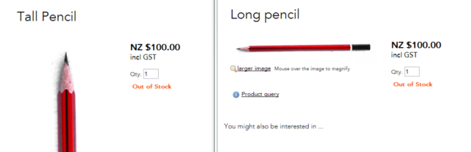
An image is worth a thousand words, so stock images are a great way to quickly illustrate your point on sales and marketing materials. Not all of us are great photographers or have the equipment to take good images for our website, so it is great you can go to image depositories such as istockphoto.com, depositphotos.com and gettyimages.com (to name a few) and purchase photos and images to use across your promotional resources.

However for every great image there are hundreds of sub-par or just plain bad images. If you ever need some entertainment just look at this page for some amazingly bad examples! There are also some comic themes that pop up on these sites, such as “businessman doing yoga” or “woman laughing alone with salad” that will have you scratching your head in confusion or rolling on the floor laughing wondering what people must be writing about! 

Some tips to consider when selecting your stock images.

Take Stock blog written by Zeald If you can take a picture yourself, don’t use a stock image. 

Use images that support your content. An image should quickly tell a reader what your content is about and reinforce your message, not just decorate the page.
Take Stock Blog written by Zeald Don’t use a stock image for your products or staff. This may surprise you but it does happen. Having an image that isn't the actual product does nothing for the trust and credibility of your business. 
Take Stock blog written by Zeald Use stock images that depict real-life scenarios. Take the businessmen doing yoga example. The likelihood of someone in a park, in a suit and tie, doing downward dog, whilst on a laptop is probably rare. Your point will be illustrated much better with another image.
Take Stock Blog written by Zeald Beware of overused images. Take a look at your competitor’s sites and make sure you aren’t using the same or similar images. You need to find an image that will represent your brand in a unique way.
Take Stock Blog written by Zeald If you plan on using the image in print, don’t buy the low-resolution web version. Your picture will look pixelated and blurry when you try to make it bigger.
Take Stock Blog written by Zeald Refresh your images. Design trends change and so the image you purchased in 2002 will no doubt be outdated. Look at the people in your images and be aware of clothing and hairstyle trends that will date your images (unless you are specifically after a retro look).
Topics: Web Design Tips
 

Landing pages: What are they, why do you need them and how do you use them properly?

Written by Casey Hartigan on April 2nd, 2013.      0 comments

Learn more about Landing Pages with Zeald Website Consultation
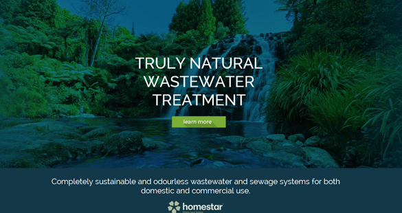
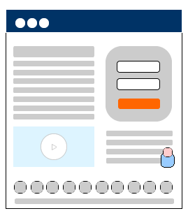
Getting customers to either purchase from you or make an enquiry should be the main goal of any website, but actually getting customers to convert can be a tricky process. Landing pages help you with this conversion process by providing relevant information to specific groups of visitors and guiding them towards a main goal.

Essentially a landing page is a web page that is separate from you main website. It is typically linked from a campaign and contains

  • no navigation to other pages on your website
  • call to actions
  • tailored copy to suit particular visitor’s needs.
For example, if you were to send out an email campaign to your existing customers with a special offer for a new product, you would want to target the content on this page to people who are familiar with your offering. The purpose of this page would be completely different to one that was linked to from your Ad Words ad, which would typically be new customers who have only read a few sentences about your company.

So how should you use landing pages effectively?

1. Only have one message/goal per page

Unlike the rest of your website, which is likely to be more generic and aimed towards a wide range of people, a landing page should be extremely focused towards one particular customer group and goal. Don’t confuse your visitors – if they clicked through to find out more about a discounted product, only tell them about this product. Make sure your headline shows customers that they have come to the right page for what they are looking for.

2. Keep the main message the same throughout both the campaign/ad and the landing page.

The main benefit of a landing page is that you can tailor the copy to specifically match a particular campaign. For example, if you are sending out an email offering 25% off a new product to people who have purchased from you before, the email and landing page should both highlight this deal, so that when a customer decides to click through from your email to the website they are easily able to see that they are on the right track to getting their discount.

3. Have a clear call to action

The call to action on your page needs to stand out. Ideally, there should be a call to action near the top (as soon as you’ve finished your initial sell) and then repeated further down the page as you answer any other questions people may have. This allows people to convert easily and quickly.

4. Ensure you landing page has a professional design

Your landing page is likely to be the first page that many potential customers click through to, so it’s extremely important that the design is clean, uncluttered and in line with the rest of your advertising. If you are using long blocks of copy, break it up by using bullet points and headings and include call to actions throughout.

5. Test, test and test some more

The single most effective way of ensuring that your landing pages are working the best that they can is to conduct split tests to test different versions and changes that you make. Split tests involve directing traffic from your campaigns to different variations of your landing page and provide you with actual data that you can use to make decisions on which one to use.


Free Zeald Website Consultation


How to write an effective unique selling proposition

Written by Casey Hartigan on October 1st, 2012.      1 comments

Your unique selling proposition (USP) is one of the most important parts of your homepage. Visitors to your website need to be able to tell almost instantaneously whether or not you will be able to fulfil their needs. An effective USP achieves this by telling the customer what you have to offer, and more importantly, what sets you apart from your competitors. It should be placed right at the top of your website so that it is one of the first things your visitors see. Follow the steps below to write an effective USP for your business.

1. Identify and define your target market

It is important to realise that you are not going to be able to serve every man and his dog. Before you can begin to sell your product or service to your visitor, you must define who it is you want to target. For example, if you are a caterer who solely caters for weddings, instead of targeting anyone who is looking for a caterer, you may choose to target people who are planning their wedding on a budget.

2. Identify the problem that your customers have and how you can solve it

If your website visitors didn’t have a problem, they probably wouldn’t be on your website! To make it clear that you are the correct place to be you need to spell out what problems you are able to solve. Let’s go back to the catering example. There are many people who will be looking for someone to cater for them, whether it be for a birthday party, funeral, work function or wedding. If you’re a caterer solely focused on catering weddings on a budget, then it is important to place emphasis on this. It’s important to remember that you can’t solve everyone’s problems! Be the best that you can at what you do rather than average at doing everything.

3. Point out what makes you different from your competitors

Pointing out what makes your business unique is one of the most important parts of your USP. Write down what separates you from your competitors. Are you the cheapest? Fastest? Most knowledgeable? Tell your visitors what sets you apart from other businesses who could fulfil their needs.

4. Write it out and refine it

Once you’ve figured out who your target market are, what problem you can solve for your customers and what sets you apart from the competition, it’s time to put it altogether in a short and sharp sentence or two. This process can take a while to get the final product, so give yourself plenty of time. Spread it out over a couple of weeks as fresh eyes are always best!

5. Put it on your website

Once you’ve finalised your USP, put it near the top of your website. If you have images on your homepage, try and link them in with your USP to give it more strength. You may find that after a while your USP will need refining again to keep it in line with the ever-changing ways of your business – if you find this is the case, just start again at step one and identify what changes need to be made.


Get a Free Zeald Website Consultation


About Zeald

Zeald was formed in 2001 by three young guys from the small New Zealand town of Mangawhai Heads. Now, Zeald is the largest website design and digital marketing agency in New Zealand and has recently made moves into Australia. This is the Zeald story …

read more
 

Connect With Us

Keep up to date with industry news, stay ahead of the competition with our helpful articles

Google Plus Facebook Youtube Twitter Linkedin


Contact Us

New Zealand
09 415 7575
Australia
1800 224 032

42 Tawa Dr, Albany, Auckland 0632

Support