WEBSITE DESIGN & DIGITAL MARKETING

Menu
Email me when new posts are made to this blog

Free, easy to use photo-editing software

Written by Casey Hartigan on August 24th, 2012.      0 comments

They say a picture’s worth a thousand words, so having good-looking images on your website is extremely important.

However, professional photographers and photo editing software can be extremely expensive which means many businesses have to take their own photos for their websites. Luckily, there are loads of online photo-editing software available for free, which, if used effectively, can make your images stand out from the crowd. Our favourite is PicMonkey, which can be used in your web browser – no need for downloads! Just visit www.picmonkey.com and have a play around.

Handy hint: When saving your image from PicMonkey, choose “Mel” as the quality. This will save a smaller file, which will help to lower the loading time of your website.

Free Zeald Website Consultation

Topics: Web Design Tips
 

Get Your Business Seen - Use Video

Written by Casey Hartigan on July 17th, 2012.      0 comments

Video is becoming increasingly important when it comes to ranking in search results. YouTube is owned by Google and is one of the leading search engines in the world, so having video means you're more likely to get noticed. In fact, studies show that a page with video is 53 times more likely to be seen in search results (Forrester, 2010). However, choosing a subject for your videos can be quite daunting and many businesses tend to put it in the too-hard basket.

If you're selling products, consider making a short video of what the product is and how it's used, or give a short tour of your store if you have one. If you're selling a service, you could film some examples of your service or give tips and advice related to your industry. All of these ideas will help to create credibility and make sure your business gets seen.

When making a video, make sure that you keep it short and to the point. It's also important that it's of good quality. Ensure that you film in a well-lit room and that you keep the camera steady. If you're going to speak during the video, make sure the recording is clear and understandable. Then, once you've created your videos, read up on how to embed them on your website.

Free Zeald Website Audit and Consultation
 

Don't Build a Mobile Website; Get One Site That Fits All

Written by Emily Wilson on July 17th, 2012.      0 comments

Over the last few years, more and more people and businesses are using mobile devices to browse the internet.Responsive Design Services with Zeald Nearly a third of New Zealand internet users access the internet via a Smartphone; and this trend will continue to grow in the future. This means that with more and more different types and sizes of devices coming online, your website pages will need to look different depending upon what is displaying them. Enter responsive design.

Responsive design is a way of designing web pages for mobile and desktop devices; in fact, the idea behind responsive design is that you design your web pages so that they respond to the device that is viewing it. Rather than forcing a mobile user to see a desktop site, a laptop user with a small screen to scroll horizontally to see a wide-screen monitor site, or a wide-screen monitor to view a site as a mobile customer might like, the design looks at each of these scenarios and adapts to display the content most effectively.

Why Responsive Design is a Good Idea

The best web designs are the ones that make things easy. Responsive web design makes your website user friendly for mobile customers. It is web design that responds to the user as they arrive at the web page.

Think about your typical desktop browser. Even if it is not maximised, it almost certainly has a width of at least 960 pixels. That is a lot of space to place lots of columns of text and images. If you compare that with a smartphone in portrait mode, you are looking at a device with about 480 pixels of width. That is half the screen space. A feature phone has even less space with 320 pixels or less in most cases.

If you create a page with a fixed-width layout 960 pixels wide, it will look great on your desktop monitor. But when you view it on a tablet, it’s going to look small. A smartphone will make it look even more cramped  and on a feature phone, the page might not display correctly at all.

However, with responsive design you create a design that works for any of the devices visitors to your website use. What sets responsive design apart from other methods of mobile websites is that you don't create a separate webpage for every type of mobile browser you want to support. Instead, responsive design simply looks at the features of the device viewing the page, and delivers the styles appropriate for that device.

Creating a Whole Separate Website is a Bad Idea

It can be tempting to create a “mobile” site with a separate sub-domain or site location. Then you just put all the mobile friendly site features like single-columns, limited content, and reduced navigation in that one location and point mobile users there.

In the short term, this can work, as it gets up a mobile site quickly. But eventually it will start to cause problems. The first issue comes when you realise that you have to post every article twice; once to the main site and once to the mobile site! Why create that extra work for yourself?

Responsive Design Treats Mobile and Desktop the Same

A responsive web design uses the exact same content to create a page that works whether you are viewing it at 1800 pixels wide or 320 pixels wide. But the pages that are created may look vastly different, while containing the same content. This means that whether you come to the site on an iPhone or a 27-inch iMac, you will get the same content; in fact you will go to the same URL. But on the iPhone you might see the page with only one column while the iMac gets five. But they are both considered equally important when delivering the content.

Responsive Design Services with Zeald

The website responds the the device and adjusts accordingly, while still retaining the important content.                             

Take a look at an example in action on a few different devices

Is Responsive Design Right for Your Business?

It depends what your customers are using to visit your site. You may find that it is not cost-effective enough if only a very small percentage of your customers are using mobile devices to view your website. You can use Google Analytics to track traffic to your regular website that comes from mobile devices like iPhones and Android devices. All traffic from mobile devices can be viewed by device or carrier under the 'Visitors' section in the 'Mobile' tab of your Analytics account, or in the 'Mobile advanced' section.

Responsive Design at Zeald

Zeald are now offering responsive design on all our websites. 


Topics: Web Design Tips
 

Proofreading Blunders

Written by Emily Wilson on June 5th, 2012.      0 comments

We are all guilty of making mistakes; especially when it comes to proofreading our work. Mistakes on your website canProofreading Blunders not only be embarrassing but cost you money too. Shoppers nabbed a real bargain at Comet, an appliance retailer in the UK, when they made a costly mistake on their online store by misprinting the price of an Aiwa hi-fi which regularly retails for £89.00, instead listing it at the amazing price of £8.43. The company lost a huge amount of money before they corrected the error.

A slightly less costly, but still embarrassing example from Air Canada was when the airline accidently used luggage stickers which stated: “This Baggage Has Been X-Rated at Point of Origin”. Oops, I guess they found the adult magazines that were hidden in the bottom of your suitcase?

Mistakes like these often come down to human-error and can happen when you are under pressure to meet a deadline. But they can sometimes just be overlooked or not fact-checked thoroughly. Some people just have a deep love for unnecessary capital letters, or enjoy over-exclaiming – it is best to stop using exclamation marks in bulk, one will suffice.

At a basic level you want to use spell check. That said; don’t rely too heavily on spell check as it won’t pick up every mistake as anyone who has made the public/pubic mistake will know. Read through your finished document thoroughly once you have used spell check to avoid the embarrassment that comes from discussing third panty insurance.

If you have a long document it can help to double-space between lines. It makes reading and proofreading easier because you can write above and below the sentences. Print a hard copy of your document - no matter how many pages. You are bound to catch more mistakes than just reading the onscreen version.

Read your work aloud to catch mistakes the eyes often gloss over and mark off mistakes with a red pen; not just for fun, a contrasting colour actually helps you spot the mistake when you make the correction later. (If you really want to you can grade your work and add a smiley face or gold star at the end!)

Get some rest and get less-familiar with your work. That means take a break; take a day, week, month away from the document. As the author you can become a little self-involved and miss errors that with fresh eyes seem so obvious!

Poor spelling on your website could cost you. Customers may be dissuaded from making a purchase from a site that has poor spelling and grammatical errors, as this reflects badly on your credibility. It pays to write copy using word processor software first to make sure it is perfect, plus you’ll have a file you can save if you make changes to your page.

Make sure your website copy makes sense. All too often people try to cram those important keywords in for SEO. Part of the sales process is to convert visitors who find your page, you will find them leaving all too soon if they can’t make sense of your text.

You should also check and double-check your emails before you hit send (same goes for Facebook and Twitter posts). Email and social media may seem like a less formal ground for communication, but if they are business related then you will want to reflect your branding and professionalism. Emails and posts can easily be forwarded or shared with others; which can land you in hot water.

One common mistake is to get recipient’s name wrong. Check their email signature for how their name is spelt, and whether they use a variation of it. I’ve been called, on more than one occasion, Emma Watson. Close, but not actually my name. It can help to keep a list of names that you have fact-checked to save time rechecking.

Take a break.

If you are using numbers, equations or calculations, best make sure they work. Same goes for graphs and other images including their caption. Often decisions about spending (or not spending) are made by graphs, calculations and prices, so they can make or break your sale.

Even if you know the difference between it’s (the contraction) and its (possessive), your fingers may not. Using the “find” function of your word processor and run a search just for apostrophe marks to help locate and catch errors.

If your work is ever changed by someone else into another format, it pays to check it before it goes live. This is especially true when booking advertising.

Don’t be afraid to ask for help. It is better to have someone at the office spot your bad spelling than a potential client! Plus if there is a mistake you can pass on the blame! Remember if you are no word-smith then it may be beneficial to hire a professional to write and/or edit your copy. Valuable advice for tattoo artists also! Google “misspelled tattoos” and you’ll see what I’m talking about.

Free Zeald Website Consultation and Audit


Free Image & Photo Editing Software

Written by Hamish Braddick on April 1st, 2012.      0 comments

Picozu  Photo Retouching and Image Drawing with Zeald picozu

is an image drawing and photo retouching application built on Javascript, HTML 5 and CSS3. Make sure you use a modern browser (Firefox 5, Safari 5, Chrome, Opera 10, Internet Explorer 9) if you want to play with it.
Aviary Web Based Multi Media Applications

Aviary

Aviary is a suite of  web-based multi-media applications primarily for image editing and graphic design. The individual tool names are bird-themed, hence the suite name.

Aviary have 2 plans: a free plan and a Pro plan. Only Aviary Pro members can test current alpha releases ahead of time. Pro Members also have the ability to remove the Aviary Watermark, create groups, and view Premium Tutorials as well as unlimited storage.
The great thing about Aviary is that they provide the option to store your images online and host them for you. This is handy for centralising your images and saves cluttering your hard drive.

PhotoPlus

For a long time, Serif has given away previous versions of their software to entice users to purchase the current version. Currently you can download a completely free, fully-functional version of PhotoPlus.

PhotoPlus 6 is an Offline image editing software that enables you to create, manipulate and enhance photographs or bitmap graphics. You'll find all you need to produce professional looking images for print and the web.
Topics: Web Design Tips
 

Correct the names of your images to improve your SEO

Written by Casey Hartigan on February 29th, 2012.      0 comments

You've probably heard how important it is to include your businesses major key words on your homepage, but what you might not know is that Google looks at a lot more than just the text on the page. By using key words in your image file names, you can help you website rank higher in Google for those important key word terms.

Chances are your images are named something like "X20110105%homepage%product%1" - you can double check this by right clicking on the image and choosing properties. The problem with names like these is they give no indication to search engines about what the image is actually of. Instead, change the name to include key words e.g. if the picture is of a MacBook Pro, change the name to apple_macbook_pro_white. This way search engines will have more indication as to what is on the page and will therefore rank your page higher.

                     Correct your Image Names to Improve your SEO with Zeald
 

Homepage with image slideshow obtains 44% more revenue in split test

Written by Hamish Braddick on July 24th, 2011.      0 comments

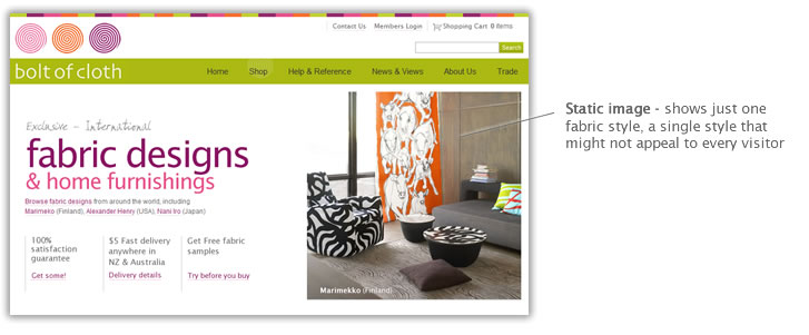
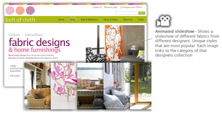
As the follow on from our previous Homepage radical redesign test we really wanted to see if an animation on the homepage would help to capture visitors attention and draw them into the website, or perhaps the additional load times would serve to put people off and the animation might distract users.

Original page

Following our 11 checks for Landing page optimisation we outlined a list of points for improving the page:
Bolt of Cloth Web Design and Optimisation by Zeald

New page

Bolt of Cloth Web Site Design and Optimisation by Zeald

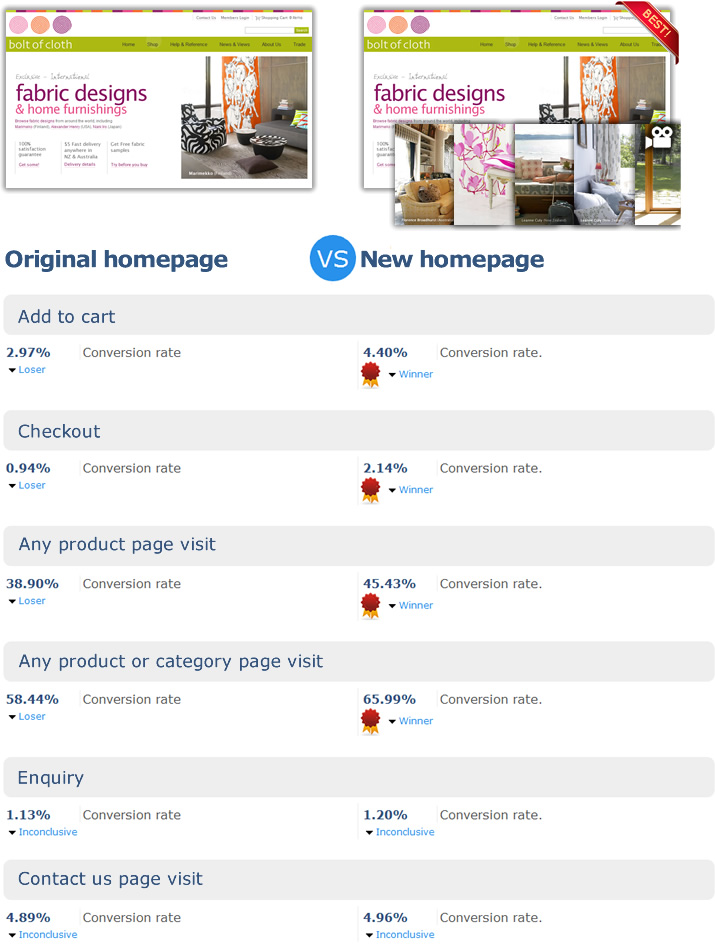
The results

animation-results
This test was run using the Zeald experiments software and shows reduced information for privacy reasons

What did we learn?

  • In this case animation does help to improve conversion

What next?

I would like to see if different uses of the animation can help to improve conversion. For example,
  1. what if the animation was used to support the USP,
  2. what if it showed the actual products, not in context,
  3. what if the video was used to promote incentive such as free shipping, guarantee etc 
 

Animation Support with Zeald We want to help...

Please don't forget we are right here. We have a team experienced in achieving great results for NZ businesses. We can help you with Online Marketing, SEO, Results Consulting and more...Let us help you generate more sales and enquiries with your website.  Please talk to us
 

Split Testing

Written by Evan Cooper on July 12th, 2011.      0 comments

The single most effective method to improve the performance of your website

Split Testing is the single most effective way to increase the performance of your website. Split testing is not only effective, it is also an inexpensive way of making improvements to aspects of your website, using your own customers as a democratic tool to help make decisions. Who better to understand the needs and wants of your customers than your customers!

First you need to understand that building a successful website is a process of continual improvement, which involves:

  • Establishing the goals of your website. i.e. sell products or generate enquiries
  • Optimise your important website pages to achieving these goals - these pages are known as landing pages

So what are landing pages?

  • A landing page is the first page a visitor to your site sees.
  • Landing pages are often 'linked to' from marketing campaigns, social media and email campaigns.

Optimising a landing page

  • For each landing page you need a goal. In many cases this will be to convert site visitors into sales or leads. An ecommerce homepage might be to “click through to a product”
  • Improving a landing page involves increasing the number of goals achieved, or convert site visitors into sales or leads. This is known as the Goal conversion rate.
  • Remember, your website is a leaky bucket full of holes and by plugging these holes you retain the precious customers and stop them from leaking out.You improve the number of customers who take the desired action you want them to. You improve the conversion rate of your pages and you improve the performance of your website in general.
Usually when you want to optimise your website you make changes based on a gut instinct, best practices, research, personal preference, previous experience and measuring your goal completions to give you an indication of which changes were positive or not. While this method is most likely better than nothing, this won't tell you exactly what is working or not working.

So what is split testing?

Split testing  involves running experiments on landing pages of your website. You choose a page you think needs improving and duplicate the page; the original page stays the same, while aspects of the duplicate page change. Traffic gets split between the two versions evenly and the split testing software tells you how the new page's conversion rate differed from the original. If you see a significant increase in goal conversion, you keep the highest performing page and continue the process of improvement by testing other aspects on a new page.

How does split testing work?

  1. Pick a page that you think needs improving, starting with the most important pages that are used to complete the goals of your website.
  2. Create a new version of that page and make changes you think will improve the performance of that page, changes that you think will help increase the number of goals your website visitors complete after viewing this page.
  3. Setup a split test experiment using split testing software.
  4. Run the experiment.  Your website will show each page in your experiment to alternate visitors.  The split test measures how many visitors you get to each page and how many of those visitors complete your website goals - like making an order, completing your enquiry form, signing up to your newsletter, or clicking through to your 'About us' page etc. The split test needs to be run long enough to prove conclusively that one page is a winner.
  5. Replace the lesser performing page with the one that’s performing better. 
  6. Repeat the process again. Measure, change, review. The idea is to keep optimising your important pages to continue improving your website’s performance.

Split Testing Landing Page

The importance of finding a conclusive result

This is a scientific method of optimisation, relying on good accurate measurement and finding conclusive results that are statistically significant.

If your results are 50:50 - You don't have a conclusive result

If you don't have enough data to work from - You don't have a conclusive result

In order to collect enough data in the shortest amount of time, you need a reasonable amount of traffic to your website and a reasonable goal conversion rate to measure. You really want a conclusive result within a month. i.e. you don't want to be running a test for 3 years.

Split testing reports

The reports are a very important part of the split testing process. They need to make it very easy to accurately determine which page is the winner. As with any type of polling, it’s necessary to know just how precise the results of the statistics are.

That sounds easy

You already knew that you should be optimizing your website, but the task seemed like a long, difficult and expensive process that only large international companies could afford to tackle.

The power of split testing lies in its simplicity and accuracy.

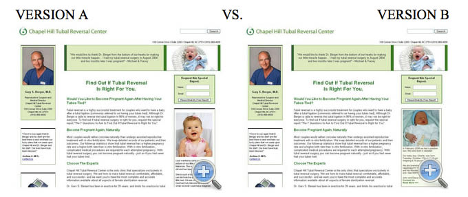
Case study - Happy baby vs Crying baby?

In the split-test example below, the effectiveness of a testimonial was tested using identical pages with only the accompanying photo changing. One page used a photo of a happy baby and the other a photo of a sleepy newborn. Regardless of which you think is the best, it is the power of split -testing that gives an un-biased and scientific result for use in improving the results to your website.
Control and Treatment Split Testing

The answer may surprise you - the unhappy baby beat out the happy toddler by 12%!

There are large gains to be made if conversion rates are raised. Businesses can see massive benefits from testing then implementing improvements on anything from their homepage, call to action, or a product page to create more click-throughs. It is the ability to continually improve your website and have reliable stats to back it up that makes split testing such a powerful tool.

Where to from here?

Chances are you’re so excited about starting to test your website that 10 different tests are floating around your head for your homepage alone! Be smart about your testing...
  1. Come up with a plan! Decide what your end goal is (more email newsletter signups, increased click-throughs to product page, more sign-ups etc)
  2. Pick an element to test. For inspiration read some case studies of other successful tests.  http://whichtestwon.com/ is a fantastic blog that lets you see real tests and guess which version of a page improved results.
  3. Setup the test. You might need to get new photography, graphic design or new copy written. This step takes time so its important to have a solid plan and stay motivated.
  4. Run the test! Depending on your sites traffic it may take awhile before you have conclusive results. We recommend at least 1000 unique visitors before starting a new test.
  5. Repeat the process again. Measure, change, review. The idea is to keep optimising your important pages to continue improving your website’s performance.

Split testing tools

To conduct split tests you need a great tool that is:
  1. Easy to setup
  2. Accurate
  3. Easy to understand - great reports that make it obvious which page is the winner
  4. Able to measure all the important goals of your website

There are a number of split testing tools available:

  • Split Test Accelerator - $891US
  • Split Testing Pro - $147US
  • LinkTrackr - $227US p/year
  • Affiliate Prophet - $97US
  • Google optimiser - Free
  • Zeald experiments tool - Free (with any Zeald website)

If you aren't testing, how do you know if you are making changes for the better?


Mobile Websites - A waste of time for small business

Written by Brent Kelly on June 20th, 2011.      0 comments

Without a doubt, one of the biggest trends in the online space at the moment (aside from social media) is the rise of the use of mobile devices to browse the internet. Widespread acceptance and use of devices such as the iPhone and iPad, along their Android-compatible competitors, has seen a huge rise in the number of people with access to the internet through their phone and, as mobile data rates come down, this trend is only going to accelerate in the coming years – both in New Zealand and abroad.

As NZ businesses become more aware of this trend, we are starting to receive the odd related question – do I need to have a specific mobile-compatible version of my website? Am I losing business by not having one?

A bit of history - mountain to Mohammad & all that ...

In the early days, mobile devices were very restrictive in their navigation of websites. This resulted in some websites being created specifically for browsing on mobile phones. However, it was always highly unlikely that the internet would reinvent itself to support these restrictions. According to the Netcraft Web Server Survey, as at June 2011 there were around 346 million websites on the internet – that’s a lot of sites to rebuild to support these technological restrictions!

Instead, what we have seen over the last few years (especially with the release of the iPhone – thanks Mr Jobs), is a major leap forward in the ability for mobile devices to correctly display normal websites, and allow people to navigate them easily. In this day and age, provided the site is well designed & built, it should be relatively easy for a mobile user to navigate and read – as is.


Let’s back up for a second

To objectively consider the relevance of a mobile specific website for your business, I think it’s important we step back for a moment and consider your objectives in getting a website in the first place. For most businesses we encounter in the NZ marketplace, their primary objective is to generate sales and/or leads.

So when we are asking – “should I have a mobile website?”, one could argue the question actually is “will a mobile website generate more sales or leads for my business”. Or even more accurately, “will the time and money I invest in building, running and maintaining a mobile version of my website provide me with more sales or leads than other activities I could be investing that same time and money in”.

The success of your website is ultimately determined by your ability to get targeted prospects to your website, and once they arrive, convince them to do business with you – to actually pick up the phone and call, or enter their credit card details and make an online purchase.

So should I get a mobile version?

Unfortunately, the majority of NZ businesses we encounter are struggling with the core requirements for a successful website. Because of this, I believe we could compile quite a list of areas to invest into with regard to the average website that would provide greater return on investment, than the creation of a mobile version of the site.

Would a well thought out, well planned mobile version be useful? Most definitely. Would I recommend it in a perfect world where businesses had unlimited resources? Most definitely. However, in the world of very limited time and budgets, I would argue there are much bigger fish to fry. Areas such as; testing headlines, strategy sessions (to help understand your target customers better), planning and organising targeted promotional campaigns and usability testing would all provide greater return on investment than the creation of a mobile version of the site.

Only once all of that is sorted, would I recommend you get down to the ‘finer details’ such as custom versions of the website for mobile devices.

Ultimately, it is essential that our website is persuasive in the first place - otherwise you just end up with a mobile version of your website that still doesn’t persuade customers to buy – it’s fractionally easier to use, but still convinces no one.

Have one website that works for everything.

My advice is to keep it simple. The last thing we want to do is distract you from is having a highly persuasive website – especially when killing two birds with one stone is so easy. A Zeald website naturally suits mobile browsing in a lot of ways:

  • We recommend that all your web content is in HTML (rather than in images etc). This means it will load quickly and automatically scale to a phone’s browser window as a visitor zooms in and out.
  • We help you create a website that loads quickly – essential for slow and costly mobile web connections.
  • We educate & assist you to identify topics for large (in font size), compelling headlines which spark attention – these can be read when ‘zoomed out’ on a mobile device & can be used to convince the visitor  it is worth their time to zoom in on that section and read the detail.
  • We don’t recommend using flash, which doesn’t work on iPhones.
  • We avoid drop menus or any ‘rollover’ functions – they don’t work on phones either.

Users who visit your website with an iPhone or similar mobile device will still be able to browse it easily and look for the information they want. For return visitors it has the additional advantage of looking familiar when they loaded your site on their laptop (navigation hasn’t moved, the layout of the website is as they would expect).

Whatever the case – it will be the effectiveness of the content on the website that determines whether they buy from you or not. How well you answer their questions, and persuade them to trust and do business with you.

Topics: Web Design Tips
 

The 1 reason website designs fail (& how to fix it)

Written by Hamish Braddick on May 2nd, 2011.      0 comments

(This presentation requires Flash, if you don't have it, you can download Flash here. View other presentations from Zeald)
Firstly, it's important to understand that the success of any website is measured by the results that it achieves.
 

What do we mean by website results?

When visitors of our website complete the actions we want them to complete - i.e., more sales, more enquiries, more bookings, more business and more customers.

So how do we get more visitors to take action on our website?

There are 5 factors to work on...
  1. Find visitors who are motivated - this will happen if the promotion is relevant, i.e., it's attracting the right kind of people to our website

  2. Convey the value proposition - the website needs to communicate this aspect quickly and clearly

  3. Reduce friction - make it easy for the visitor to navigate around the website and complete the website goals smoothly (for example, long or unnecessary forms can lose visitors).

  4. Relieve anxiety - get  the visitors to trust you so they are willing to do business with you

  5. Create incentive - offer something to prompt action (putting a time frame on it can also create urgency)

But....... the one thing that most websites ignore and the one thing that can make the most difference (from our experience) is a value proposition conveyed clearly and concisely!

What do we mean by value proposition?

When anyone visits a website, they have 2 questions in their mind....
  1. What? What is this about? What can I do, buy or get here?

  2. Why? Why should I be interested? Why should I continue?

Marketing Experiments study shows that if your website can't answer these 2 questions in about 3 seconds, visitors are less likely to take action.

Therefore, in the first 3 seconds, the top part of the page needs to tell the visitor why they should stay here to look for the solution..... rather than look somewhere else.

The order is important

Not only does the page need to answer these 2 questions, but it's important that the questions are answered in the correct order.

Our tendency is to rush into 'why' before we have answered 'what'. For example, it's no use describing the unique flavour if I don't even know that you sell ice cream.

Otherwise you create confusion..... & confusion creates mental resistance.

How does design fit in?

The visitor must be interested, understand and believe the message and design is the art of presenting that message.

Great website design will communicate the message...
  • Clearly
  • Concisely
  • Quickly

How can design do this?

Using an eye path

Design controls what the visitor sees 1st, 2nd, 3rd and 4th. There are 6 ways to control this...

  1. Size
  2. Colour
  3. Shape
  4. Motion
  5. Depth
  6. Position

We use these methods to emphasise one thing over another - we create a visual hierarchy to control what the visitor sees 1st, 2nd, 3rd & 4th.

Let's see that in practice....

  1. Present the message in a linear format so that the visitors' thoughts come in the right order. Their eyes should travel from top left down to the center through the headline and vertically down the page.

  2. Incorporate the value proposition in the opening headline. If the visitor reads anything on the page, you can guarantee that it will be the opening headline.

  3. Make the message short and sharp. Get straight to the point - provide just enough reason for the visitor to continue with the next step.

  4. Break content into headings and sub-headings - Use bullets or icons such as a 'tick' to break up text and draw the eye

  5. Use large text for important words

  6. Remove clutter

  7. Reduce distractions - Remove, separate, tone down 'related content' so it does not distract from the primary message

  8. Convey the message with images - take care not to confuse or distract with irrelevant images

  9. Tell the story with case studies & testimonials - convey your value proposition through a story and build trust and credibility

  10. Convey your message with your 'call to action' - let the visitor know exactly what you want them to do next

  11. Use white space - to reduce clutter and make the message easy to read. Think of it like a 'pause for effect'

  12. Use depth - depth can be used to separate and emphasise content. Textures and drop shadows create the illusion of depth

And finally... our golden rules

  1.  'Quirky no worky' :-)

  2. And always remember to measure, review and improve for continual progress and improvement on your website results.

It is easy to design a good looking website. A good web designer will create a website design that is unique, reflects the brand and builds instant trust with the visitor.

It is hard to design a website that generates results. It takes an expert designer to create a website that presents the right information, in the right way so it achieves your business goals.

Contact us for your website needs


Top web predictions for 2011

Written by Hamish Braddick on January 25th, 2011.      0 comments

Top Web Predictions Last year was a huge year with major changes in the way that people have used the Internet, which in turn changed the way businesses market their products and services. 2011 is set to follow the trends started in 2010. Here are our top 8 picks of the some of the predictions:
1. Video will continue to rise

With the rise of mobile handsets that have video capability, the use of video has become very common and this year video will become very important for sales and support. The growth of streaming TV with Apple TV, Google TV and Zune, TV will become more popular. These technologies will make it easier and give users more choice to watch TV as they like and when they like. This will also cause a huge amount of bandwidth to be used up both through cables and mobile. It is predicted that this will slow down the Internet so it's still very important that websites are fast loading.

2. Growing cloud computing

There will be a rise in web apps following the success of mobile apps and as a result cloud computing will grow. This means a lot of content will be shared online - documents, files, videos and audio.

3. Social media will continue to grow

Experts everywhere believe that social media is here to stay and it will no longer be considered new or an optional marketing activity. People now expect to be able to communicate with businesses on multiple platforms and instantly. As a result, businesses will start integrating social media into their other marketing activities - with a focus on ROI. Facebook has developed a great weekly reporting system along with analytics on every post which makes it easy to measure the level of interaction.

4. Referrals based on network

Search engines have already started including results which include any mentions from anyone in your social network to do with your search phrase. This will start to grow even further as your network will start influencing your search behaviour even more. Users will be able to see who in their network knows the dentist they are researching or went to school with the accountant they are looking into.

5. Online advertising

More business will start testing out online advertising - not just with Google Adwords but also Facebook and Gmail advertising which will be content based and highly targeted.

6. Email marketing

Despite the rise in social media marketing and online advertising, email marketing will still be a strong player in marketing activities for businesses. It will still be seen as a low-cost and highly effective tool to promote products and services.

7. Mobile marketing

Marketing on mobile devices has been talked about a few times over the last few years but finally it is predicted to take shape this year, especially for the small business market. This doesn't meant that more businesses will start texting or using mobile ads but instead it's about offering mobile payment systems and any apps related to it. Increase in usage of location-based social media like Foursquare means that location-based offers could come into play in 2011.

8. Local searches will become prominent

Searches relating to a particular location will start becoming very prominent in 2011. The potential to attract new customers via local search is massive. Depending on the IP address of the computer, search engines are already able to provide search results relative to the location. Now with mobile devices, it's even easier for Google to find out the exact location of the user and therefore provide them with very targeted search results. This provides a massive opportunity for small businesses like restaurants, accommodation facilities, lawyers, plumbers, retail etc. so getting your web pages optimised for location will become very important.

Topics: Web Design Tips
 

Plan your website resource and schedule regular periods to optimise

Written by Hamish Braddick on September 12th, 2010.      0 comments

You can't just publish your website, leave it and expect it to succeed.

The number one reason websites fail is because they are forgotten about and neglected. Remember, running a successful website is like running a business. It involves regular ongoing improvement.

Inhouse vs partners

You need to find the right person or team of people to work on the ongoing improvement of your website You need to first of all decide whether to work on it inhouse or pay for a professional.
Either way it will cost money, whether you handle it yourself inhouse or pay a professional. Your decision will of course come down to which method provides the greatest return on investment (ROI).

How much time do you dedicate to improving your website?

We are often asked this and our answer is, it depends. It depends on a number of things such as; how much budget you have available, how integral the website is in your sales and marketing process. But to give you some ideas....

Minimal - 1hr per month
Average - 2hrs per month
Healthy - 8hrs per month
Go hard - 8 hrs or more per week
Topics: Web Design Tips
 

A custom 404 page

Written by Hamish Braddick on July 14th, 2010.      0 comments

Your website users will occasionally land on a page on your website that doesn't exist. This could happen due a number of reasons - they may have typed the wrong URL or there is a broken link on your website or the link has been moved. When this happens, your website will direct them to a standard 404 page which is basically informs them that the link is broken.

A typical 404 error page is generally uninviting and unfriendly. It's very unlikely that people that arrive at this page usually explore any further - they are pretty much lost visitors.

A custom, unique error page will keep them on your website

Having a custom 404 page that is unique and guides your visitor back to a working page on your site can greatly improve your user's experience. People often make a mistake when they type in URLs and end up landing on your error page. If this page is vague and also unintuitive, you will find that your user will leave your site and never come back. This is the reason why some of the best sites in the world come up with a creative and informative designs for their 404 pages.

Therefore, we highly recommend that you take some time out to customise your error page and make it your own. You can do this by going into the back end of your website under the 'standard pages' section and edit the page called 'Page not found'.

A few tips to consider when designing your 404 page

  • Help your visitor find information. A 404 error page should do its best to help your visitors find what they are searching for. Therefore, include details of where they can go to find more information or how they can inform you about this error.

  • Avoid being vague. Providing a vague message like "Not found", "404" or just not having a 404 page at all can and will lose you valuable website visitors.

  • Use a design that is consistent with the rest of your site. Remember that this page is part of your website so keep your personality and design consistent.

  • Configure web server to give 404 HTTP status code. You want to make sure that Google spiders know that this page doesn't exist so Google will remove the page from cache so people won't come to this page through search engines. If you have a Zeald website, we will take care of this automatically for you.

A few examples of 404 error pages to inspire you

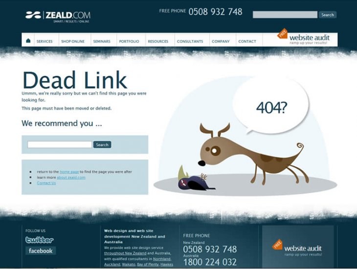
1. Zeald

Custom 404 Page

2. Livadaru.net

Custom 404 Web Page

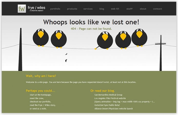
3. Fryewiles.com

Frye/ Wiles Custom 404 Web Page

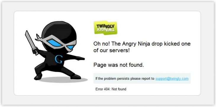
4. Twingly.com

Customise your  Error Page

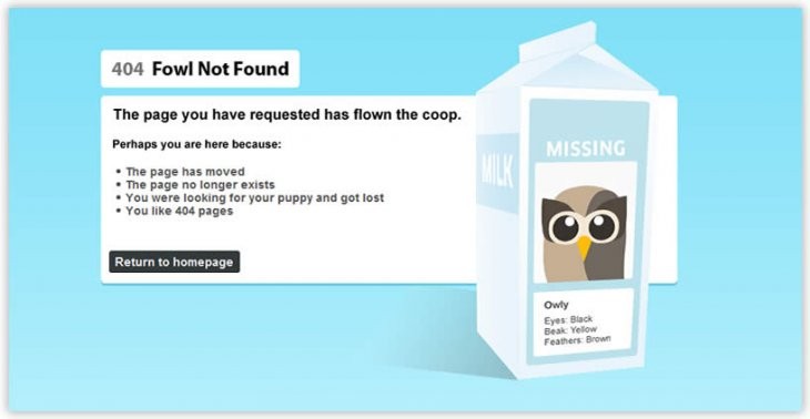
5. Hootsuite.com

Customise your Error Page

Topics: Web Design Tips
 

Designing, Building & Loading a Successful Web Site

Written by David Kelly on March 23rd, 2010.      0 comments

Web page design involves creating the look and feel of your web site. This is the step where the ‘creatives’ get involved. But, don’t get just ‘any’ graphic designer, or person you know who has a creative edge – you need someone who understands the principles of designing a web site that produces results!


Too many organisations spend a lot of money and time creating a pretty picture of their web site without considering the goals and objectives. The web page designer needs to make sure that they are designing for results. They need to keep the following things in mind:

  • attract and convert new customers
  • convince new customers to come back again
  • convert returning customers.


There are a number of web page design principles that are absolutely crucial if you plan on achieving a web site that works. So let’s take a look at the principles of ‘results oriented design’.


#1 Consistent Branding

The first principle is ‘consistent branding.’ Your web site must reflect the branding of the rest of your business. Many organisations have a great physical business with very strong branding, but then go online with a web site that does not reflect that branding. Make sure you leverage your branding, which you have already spent much time, resources and money on developing.


#2 Clear & Consistent ‘Navigation’

Visitors to your web site need to be able to navigate quickly to where they want to go. If you confuse your visitors and they get stuck and cannot figure out how to get to your ‘order’ page, ‘enquiry’ page or your checkout page, then you will most likely lose them. Clear and consistent navigation is strongly supported by placing important navigation elements in ‘standard navigational’ areas on the web page design. You can do this by making sure your web site is template-based.


#3 Template-based

Many people do not like even the thought of having their website based on a template! The concern we hear is, “my website will look like every other website.” What most people do not understand is that a template does not determine how a web site is going to look, but rather, it guides where the different information is going to be located on the web page.

This is truly a wonderful thing!

Think about this– when you go to a web site, you know that the company’s logo will most likely be located in the top-left corner and that you will be able to navigate the web site using either the menu at the top or left-hand side.


Imagine what it would be like if every time you jumped into a different car the controls were in different places.


Web page design templates have helped to ‘standardise’ the Web and make it a whole lot more user-friendly for the average Joe and Mary.


#4 Lots of White Space

Cluttered web sites are hard to read and navigate. It is important not to present too many different ideas on the same page. This comes down the objectives of the web site. Focus on the objectives of your web site. If you have two main objectives then focus the main “content” on the most important objective and have a smaller highlight for the other.


#5 Text-Page Links

Whenever possible try to use text-page links instead of graphic links. Search engines struggle to navigate to pages that are linked-to using a graphic. Graphical links can also be detrimental to the web site’s loading speed.


#6 Loading “Speed”

Studies have proven that if your web site takes longer than 8-10 seconds to load on a 56k modem then you run a serious risk of losing your visitor. Most web sites need to be designed to minimise the number of graphics on each ‘page’. There are many clever techniques that can be employed to keep the web page design sharp and rich without using graphical design elements. As a caution though, this principle needs to be balanced with the next principle.


#7 Professional Look & Feel

Your web site cannot look cheap! A web site has the difficult job of building trust and credibility with its visitors. If it has a cheap look to it, then ultimately it will harm your web site’s results. Make sure your web site has a sharp, professional look. It should “look” like it has had some time spent on it by a professional web site designer.


So there you have it. Zeald’s seven principles of web page design. If you have any questions about our design processes please don’t hesitate to contact the Support Team.

Topics: Web Design Tips
 

The Importance of Having a Clear Vision and Goal for your Web Site

Written by David Kelly on March 23rd, 2010.      0 comments

If you don't know what you are trying to achieve with your web site design then you will probably achieve … nothing!

Just as your company (hopefully) has a clear vision of where it wants to be in the future and what it wants to develop into - your web site design also needs to have a clear vision.

The vision for your web site design should be aligned with your company’s overall vision.

Ask yourself:

  • what is the vision for this web site design?
  • why are we getting a web site?
  • what is the purpose of your web site design?

Next, think, what are the goals for this web site design? Be specific. What do you want to achieve through a web site? Think about the following areas:

  • Enquiries
  • Sales
  • Brand development
  • Business efficiency

Put specifics on everything. How many enquiries or sales would you like to generate through your web site? What would make your web site an amazing success? Many people decide to get a web site without defining the reasons behind their decision. Once again, know exactly what you are trying to achieve!

Topics: Web Design Tips
 

About Zeald

Zeald was formed in 2001 by three young guys from the small New Zealand town of Mangawhai Heads. Now, Zeald is the largest website design and digital marketing agency in New Zealand and has recently made moves into Australia. This is the Zeald story …

read more
 

Connect With Us

Keep up to date with industry news, stay ahead of the competition with our helpful articles

Google Plus Facebook Youtube Twitter Linkedin


Contact Us

New Zealand
09 415 7575
Australia
1800 224 032

42 Tawa Dr, Albany, Auckland 0632

Support