WEBSITE DESIGN & DIGITAL MARKETING

Menu
Email me when new posts are made to this blog

Stock Photography Supplier Review

Written by Hamish Braddick on September 20th, 2009.      0 comments

The following table compares a number of the top Stock photography suppliers. We have rated each supplier out of 10, 10 being excellent and 1 not so good.

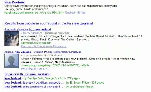
We have tested each supplier for the selection and range by using 2 popular search phrases "New Zealand" and business person"
 

Stock photography supplier

Overall rating

Selection

Photo Quality rating

Pricing structure

iStockphoto Review
www.istockphoto.com
9
Great price
Excellent quality images
Great selection
(The best selection of illustrations)
9 8 Average US$1 for a low quality web graphic and $US7 for a scalable vector illustration
Payment via a credit system
7
Great price
Good quality
Good selection
7
5
Range from Free using the www.sxc.hu catalogue
and average US$1 via a credit system
imagine
www.inmagine.com
6
Good selection
Good quality images
Reasonable pricing
Good size comp images without watermark
6 7 Average of $NZ65 - $NZ150 for low res screen images

photosdotcom_logo4.gif
 
7
Great price
Good quality
Good selection
5
7
1 month US$139.95
 
3 Months US$249.95
 
6 Months
US$349.95
 
1 Year
US$599.95

getty images
 
7
Very expensive but very high quality
Great selection
8
9

Combination of royalty free and royalty images
Range from US$100 - US$500


Corbis_logo.gif

http://pro.corbis.com/
7
Very expensive but high quality
Great selection
7   Combination of royalty free and royalty images
Range from US$100 - US$500

bigstockphoto_1.gif
 
6
Good price
Good selection
Good quality
8
6

Buy ANY photo as low as $1.48 (Buy credits – Discount oferred for bulk credit purchase)


shutter_logo_big_1.gif
 
5
Good price
Average selection
Average quality
5
5
Subscription model -
1 Month -25 per day
US $139

3 Months -25 per day
US $395
 
6 Months -25 per day
US $749
 
1 Year -25 per day
US $1359

photo_new_zealand_logo_1.gif
 
5
Very expensive
Great NZ selection
5
7

Rights protected only – quoted manually by account manager


How to optimise images on your website

Written by Hamish Braddick on April 1st, 2008.      0 comments

Images are a very important part of your website. They tell a story and help convey information but the key is to make sure that you optimise them so the user still has a great experience while browsing your website. Use the following simple tips to make sure that your images are fast loading, tidy and professional - while still conveying the information.

Understanding the different image formats

When you are dealing with images, you will find that there are often few different file formats available - meaning the file names will have different extensions. Each one has its own benefits and depending on the situation and the kind of image, it is a good idea to look into which format works best and use that file format. The two most popular file formats for images that you will come across are Jpg and Gif:

Jpg format 

The Jpg format is very commonly used and it is good for displaying photographic images, which normally contain colour blends and tones. The Jpg file format can have several million colours, but it does not support transparency. Transparency is a feature that allows you to overlay a background colour on to your image. This is a great feature when you want to include text on a graphic background - if you go with Gif file, the background will come through the text box so the text is just sitting in as part of the background. Where as a Jpg image will not support that feature.


Optimise your images on your website
Image file types - Jpg vs Gif - photographs are a lot clearer in a Jpg format when the file size is small

Gif format

Gif images are good for small images or images with a small number of colours that are just solid colours without any fading, for example, company logos typically have a few colours and they are generally flat colours that are suitable for a Gif format. The Gif file format can have up to 256 colours and supports transparency.


The Gif format is great for smaller size images with limited colours or tones

The Gif format also supports basic animation so you can include files with animation for extra effect like these cute kittens for example:


Optimise images on your website
Gif file animation

Use image editing software

When you are editing images, like for example you want to add text to an image to explain its context or you want to change colours or play around with it to make it your own, you will need to use third party image editing software. Zeald image manager also gives you access to an image editing program but it is more basic so anything that requires editing of the image itself like colours, we recommend using other software.

You can look into Adobe programs like Photoshop and Illustrator or Fireworks but there are number of online applications you can use that are free and also very easy to use. So no need to download a program on your computer. And some of these free applications also allow you to store your files on the internet. We have reviewed a few of these options so you can choose from the best available.

Crop and resize images

Image files are made of pixels and every pixel of an image takes time to load. One of the most effective methods used for reducing the file size of an image is to remove pixels by reducing the dimensions. 'Cropping' and 'resizing' are two ways we can use to do this, and depending on the kind of image you have and what you would like to focus on, you could either use one of these methods or you can use a combination of both. Keep in mind that the final image should still contain all the necessary information to get the story across.

Cropping

'Cropping' is a feature that allows you to cut the unwanted edges of an image, which makes it a very effective technique for reducing the size of an image, while still keeping the most valuable part of the image intact. By cropping an image we can remove elements of the image – like unwanted background, sky, grass, crowds, office walls, etc. This method is pretty much like the zooming function, because we are highlighting the part of the image we want our visitors to look at.


How to make your images tell a story by Cropping
The cropped image on the right retains the information that we are trying to convey, while the original image on the left does not tell the story

Resize

'Resizing' an image allows you to change the size of the entire image – so all the elements of your image are still present, just in a smaller size. And because we are changing the size of the image, it is important to keep the proportions of the image the same, i.e., the height and the width ratio of the image, otherwise the image will look squashed or stretched. The Zeald website image manager program allows you to 'lock' the proportions so you can just change one of the dimensions, either height or width and the other will change automatically in proportion to the original image.

Use small thumbnail images and link to large files

Another technique used to reduce the download time of a page is to move large images, audio, video and animation files to other pages. Then create a link to them on your web page using much smaller images (called thumbnails). This will reduce the download time significantly so your customers can quickly have a look at the smaller images and choose which ones they would like to see a larger image of. So instead of having all your big files download onto a page, which could be slow and lose you customers, you will be showing them a gallery of images very quickly and giving them the choice to see more of whatever they would like.

A product category page is a perfect example of this method of displaying images. The category page presents a list of thumbnails and short product descriptions, which are linked to the larger more detailed page.

Reuse images

Web browsers have special software built into them that allows them to store files once they have downloaded, so that they can be reused. This is called caching. This means that if we design pages that reuse the same images, they do not need to download again and will display faster.

So once your users have loaded the first page, the transition to loading up secondary pages will be a lot smoother.

Some examples of images we can reuse on your website include:

  • Logos and branding graphics
  • Background image and textures
  • Stylistic images, such as dividing lines, header backgrounds
  • Product images for product highlights
  • Icons, for example email marketing, shopping cart
  • Accent graphics, such as "New" or "Hot"
  • Call to action buttons and graphics 

Increase the compression rate

'Compression' is basically reducing the size of a file, which also lowers the visual quality of the image. So if you have a 1Mb file and you reduce the size down to 100kb, you will lose some of the sharpness in the image. Therefore, reducing the file size is a bit of a balancing act. You want to reduce the size but still make sure that the image is not too blurry or unclear. Compression works really well when you use it to display a smaller image like a thumbnail and then link it to the larger file which will open in a new page (as described above).

Compression is usually done in image editing software such as 'Adobe Illustrator', 'Adobe Photoshop', 'Fireworks' or any of the free online sources like Picnik or Photoplus 6. You can also use the Zeald website manager, which includes software that can do basic image editing that will allow you to specify the file format you want to use, i.e., Jpg or Gif and also compress it by reducing the quality. Depending on the format of the image file you are working with, the reduction in quality appears different in different image formats.

With a Jpg image, compression can make the it blurry and also muddy. With Gif images, compression reduces the number of colours so they end up looking monochromatic.


Topics: Web Design Tips
 

Does a slow website really cost you?

Written by Hamish Braddick on April 1st, 2008.      0 comments

Having flash and lots of animation on your website might seem like an appealing option but the reality is that it could be costing you more than you think. Not only do you have to consider higher bandwidth costs and the rent of the servers, the slow loading website could actually be effecting the number of sales you get from your website.

Why is that? It's because many studies conducted by a number of experts have shown that a fast website can persuade your users to take action better than a slow website.

How exactly can it effect your business?

Not only does a slow website mean that your visitor is not getting instant feedback, i.e., they are having to wait for things to happen so they are not as engaged, but if your website is really slow the user would have left well before it even loads.

A number of large industry players have actually quantified the effect of page loading times on their results:

  • Amazon's tests in 2007 also showed that every 100 millisecond increase in load time resulted in a decrease of sales by 1%

  • Facebook also found that increasing page load time decreased the number of pages the users visited during their session

  • Google's tests in 2006 showed that increasing load time by 500 milliseconds resulted in 20% drop in traffic – that's just half a second!

This is one of the main reasons why Google is looking to speed up the web and encourage website owners to do everything they can to keep their page loading speeds as small as possible. Google recognises that fast loading websites provide a good user experience, and their job is to find the best and the most relevant websites and put them at the top of the search results. The way Google judges the 'best' results is based on a number of factors but website speed has become a big factor in the mix.

So what is a good response time for website loading?

Usability guru Jakob Nielsen in his article Response Times: The Three Important Limits gives advice based on studies on what is acceptable when it comes to response times:

  • 0.1second delay is about the limit for the user to feel that the system is reacting instantaneously
  • 1second delay is about the limit for the user's thought to stay uninterrupted, i.e., they are not thinking about any other tasks. However, even at this fast speed the user will notice the delay
  • 10sec delay is about the limit for keeping the user's mind focused on the conversation that you are trying to have. Any longer, and your user will look for other things to do while waiting for the website to load. This could very well be to surf other websites.

Since the general internet speed in NZ doesn't allow for loading speeds of under 1second, the target for your web pages should be to load within 10 seconds on a 56k modem as a rough guide. We say 56k modem because if you cater for the worst case dial-up speed scenario, you will be well covered for the broadband users. So if you are over the 10 second threshold by a small amount, you should be OK as most homes in New Zealand now have broadband.

If you'd like to find out how long your website takes to download request our free Website Audit service which will tell you exactly how your website is performing.

If you have a Zeald website, learn how to lower the time it takes for your images and content to download.

Topics: Web Design Tips
 

Top 8 Marketing Trends for 2010

Written by David Kelly on April 1st, 2008.      0 comments

Over the last few years, the use of Internet and other electronic media for marketing purposes has been steadily increasing, especially as marketers have realised the cost effectiveness of using online marketing compared to traditional forms of advertising.

In a recent survey, top marketers around the world were asked "In the next three years, do you think marketing's effectiveness will increase, stay the same, or decrease for each of the following?" And their predictions are as follows:

US Interactive Marketing Forecast Survey 2010

As you can see from the survey results, social media is seen by most of the marketers as being a very effective channel over the next three years, followed by online videos and search engine optimisation.

We have summarised the top eight marketing trends to watch out for this year:

1. Social media

Unless you have been hiding from the world, you would have noticed that social media is definitely on the rise. Although Facebook started as a means to share personal information, an increasing number of businesses are using it to build their brand and protect their reputation. Twitter is another example of a place where it's all about listening to what people are saying about your brand and being an active part of the community by contributing information to your followers.

This trend will continue and blogging will be on the increase. Companies will use their expertise to write articles and blog posts, and use social media to promote them. It will also be used as a way to build a community and network with other professionals.

Search engines vs Social Networking

2. Tweet votes for SEO

Google has always strived to provide the best possible information to users and display content that comes highly recommended and suggested. The search results on Google are based around this principle so Google looks ranks results from the most trusted companies higher than the rest.

The next stage in the evolution of the search rankings is using the data gathered from Twitter. So the search results would take into account the number of recommendations a company or a person is receiving on Twitter and rank the content by this person higher on search results.

Google's biggest challenge here is ascertaining whether the Twitter user making the recommendation can be trusted.

3. Personalised search

If you rank well on search engines and earn solid traffic through to your website from the rankings, it will become even harder to unseat you from this ranking. This makes it even harder for start up companies to rank higher as the well established, well performing sites will stay where they are.

To overcome this challenge, it is also predicted that there will be an increase in Pay Per Click (PPC) advertising, because Google might start rewarding companies that get click-throughs from PPC campaigns.

With more people spending time online, 'online branding' will become more important - companies will invest more in online branding. Currently only 6% of branding dollars are spent online, which is very small when you take into account the proportion of time people are spending online these days compared to driving or watching TV.

4. Faster load times

Google has already talked about the importance of speed on the web, and how they want to do everything they can to make the web a faster place. So it is fair to assume that Google will begin taking the speed of a page download into account when ranking results. So if you want your page to rank higher on search results, the loading speed will also become a factor.

Loading speed is also an important factor with mobile phone browsing because users on the go will not have the time to wait for a slow loading website. Research already shows that majority of web users will leave a site if it takes longer than 8 seconds on a 56k modem. With mobile phone browsing, we can safely assume that this window will be even smaller. So doing everything you can to make your pages load faster will become the way of the future.

5. Two-Engine World


The picture explains it all really.. If you are considering an online Adwords campaign your best options are to go with Google or Yahoo.

6. More queries but less traffic

Search engines are starting to give answers to users' questions without them having to leave the search engine page to another website for answers. This makes for a better user experience and return visits because it speeds up the process of getting answers. This means that as more search engines provide instant answers without the users having to click through to the websites, the less traffic companies will see coming through to their sites. 

Inline search results

7. Conversion Rate

Improving conversion rate is the best way to ensure increase in revenue. Basically you have spent all this time and money in advertising and promotion to get people visiting your website, and if they are not taking the action you want them to take it's all going to waste. Improving conversion rate is the most under-utilised marketing activity, yet it can give you the most return on investment.

In 2010, this will become a bigger focus as coming out of recession, it is now time for companies to assess their spend and see what activities are giving them the value and also what activities are increasing awareness.

Conversion rate is not just about having a marketing activity in place and testing it once, it's about having a process in place that slowly improves your conversion over time. It about making regular and incremental changes across the board to start seeing the return on investment.

Zeald has a large focus on conversion rate and has a proven process in place to help companies improve their return on investment. Talk to one of our E-Business Consultants to find out how you can improve the conversion rate of your website.

8. Email marketing

2010 will be a year where marketers will continue to rely on this channel because everyone is becoming more aware of the importance of establishing and maintaining good relationships with customers.

Marketers will get more experimental and original with content and tone of emails in order to engage customers and compete with social media. For example, the popular publishing platform Squidoo sends out very quirky and humorous newsletters to get the attention of their customers.

Topics: Web Design Tips
 

Top 8 Online Trends for 2010

Written by Brent Kelly on April 1st, 2008.      0 comments

Are you wondering what the web will be like in 2010? Here are the top eight predictions for the trends to look out for this year:

1. Mobile browsing

It's becoming increasingly common for people to own cell phones that offer web browsing. This trend will only become more prominent as phones with better browsing functions become available. And due to this increased usage, it is predicted that internet access through mobile phone will get faster and cheaper so users can enjoy instant gratification - they can jump on Google search to get answers or email people on the go. No need to wait till you get to a computer anymore.

The limitation with this trend is that the screen on traditional mobile phones are too small for general internet browsing. And since there are hundreds of popular websites out there, it is not plausible to expect all websites to have special 'cell phone' size screens available. So instead, companies like ASUS are already experimenting with flexible screens that can be folded open to a bigger size.

The mobile browsing phenomenon also poses a challenge for website design as the design needs to be optimised for smaller screens but also needs to keep in mind the fact that more users are browsing the web on computer screens with higher resolutions than ever before.

2. Realtime Bigtime 

We have all seen the social networking storm - with the use of sites such as Facebook & Twitter, we now expect and demand our interactions to be immediate and in realtime. We expect that when we want to talk to someone, we can instantly engage in a conversation, not in a day or two. This means that if your customers want help or information, their expectations are now altered, they want to hear from you straight away.  

Businesses will continue to increase their investment in online communities and social media like Facebook & Twitter because these communities and their voices can no longer be ignored. And not to mention if you have a disgruntled customer, gone are the days where they would tell 10 people about their experience. Bad experiences now simply get posted on sites like Facebook and Twitter for hundreds of their friends and followers to see. Therefore, it will become necessary for companies to start engaging in a discussion with their customers rather than just than one way communication like traditional advertising. And marketing will begin to drive this increased investment in social media.

Another trend to look out for is real-time collaboration through applications such as Google Wave, which a merge of instant messaging with e-mail and facebook. Wave is a platform for getting things done together so you and your colleagues can work at the same time sharing information, working on the same documents, using instant messaging services and social networking.

3. Content 'curator' 

The biggest challenge of recent times has been the large volume of content available on the web, and it is growing a lot faster than our ability to consume it. And experts predict that in the near future, the content on the web will double every 72 hours! So we are pretty much at an 'information overload' stage - which brings up the question, how can companies like Google source the right information for us?

Google Search and News currently uses complex algorithms that give the highest ranking to websites with the most relevant content and also websites that are trusted. But this falls short of personalisation, meaning it doesn't take into account our personal preferences and slants.

In 2008, the answer to this challenge revealed itself: your friends are your filter. With the launch of 'Facebook Connect' program, Facebook allows sites to offer content personalisation based on the preferences of your network. So say you have a network of friends that like cars, some of the content around your Facebook page will relate to this particular interest. 

And now Google's Social Search experiment is investigating whether web searching can be improved by using information learned from your friends on Twitter, Facebook, Digg and the rest. So when you search for a particular topic, the results on the page will include posts that your friends or family have put up on the subject. Increasingly, your friends are becoming the curators of your consumption, from the links they direct you to the web, the movies you watch, books you read and TV shows that you are into.

A Google search for 'New Zealand' shows content from your friends

4. Location Location 

Fueled by GPS in modern smartphones, location-sharing services like Foursquare, and Google Latitude are suddenly becoming popular. With these location-sharing services, people are able to use their phones to tell their friends exactly where they are and get recommendations on where to visit and what to do in the area.

These new services also open up a whole new type of usage like getting a coupon or a review from your friend for a cafe right where you are. And since you know exactly where your friends are at anytime, you can also meet them for a coffee.

It's a new layer of the Web. Soon, our whereabouts might optionally be added to every Tweet, blog comment, photo or video we post.

5. Mobile payments

Much of Asia has already embraced the mobile payment technology but other places like U.S. in particular, have lagged. In 2010, there is reason for optimism: big players like PayPal and Amazon are starting invest in the mobile payment opportunities. So users can now purchase things on the go, especially for items such as concert tickets and bidding on auctions, this service will become very popular.

Another newcomer Square, founded by the creator of Twitter, allows merchants to accept payments via Apple's iPhone. What this means is that now when you have an expo or a conference, you no longer have to worry about having an eftpos machine at hand, you can just use this new little add on to the iPhone to swipe credit cards or eftpos cards for payment.

6. Privacy Erosion 

We're all reality stars now, on Facebook, Twitter etc., where we display and maintain our personal brands. This means is that now we are voluntarily giving up our privacy through social media applications like Facebook and Twitter, where there is an option to allow all content to be public.

Likewise with location based devices such as phones with GPS, we are giving out more information to public about where we are at all times.

7. The Cloud 

Cloud will become a bigger trend this year. What this means is that you no longer need to save your files and applications onto your computer or desktop. They instead exist on servers online, which you pay per user and pay for as much space as you use  (know as "the cloud"). This makes our data accessible from anywhere in the world without having to take your computer with you. It also allows collaborative work so no need to save versions of files and applications. You and your colleagues can simultaneously work on the same data.

Next year will also see the launch of Google's Chrome OS, a free, web-based operating system that will pose a big threat to the likes of Microsoft Office. This web-based system will be free, require smaller disc space and will not have the long boot time that normal operating systems have. 

Google Docs on Cloud

8. Web 3.0

There is already talk of the future of a semantic web where computers will become learning  machines, not just calculators or machines that can understand patterns. This means that the computers can be taught to understand meanings of words.

Google is already starting to allow websites to set attributes to specific parts of the web page content, which means that the search results now have 'rich snippets' of information. Like for example if you are searching for a restaurant, you can click the 'options' button in Google search and have specific information under each result show up, for example reviews from other people, so you know exactly which one of the results is the most relevant to your search. So you can specify event dates, product ratings, prices, company contact details for you product.. it's just the beginning.

Topics: Web Design Tips
 

Tall Poppy - Homepage Split Test

Written by Hamish Braddick on April 1st, 2008.      0 comments

Overview

When we redesigned the Zeald website, we wanted to test a radical redesign. We wanted to convey our company's USP, which is 'Smart Results Online' - helping you achieve amazing results online.

We realised that many other webdesign companies boast this same USP these days, so we wanted to prove that we are ahead of our competitors in this regard, and for a number of reasons. We wanted to let people know that we were the best at it, and we believed that we, unlike our competitors had the proof to back it up. But it is a bold claim and we realised that in New Zealand this could be a problem with the Tall Poppy Syndrome - so what better way to find out than to TMT it.

Hypothesis

Since it was not possible to test an entire page with Google Optimiser and also test multiple conversion goals, Google Optimiser was not going to work for us. So we had our R&D team build a new Add-on module for our websites, which our TMT consultants can use to very quickly and easily to setup and measure accurately, split tests such as this.

This is very important because it allows us to test our primary conversion goal to see if we improve the conversion rate, however it is just as important that we also know how our other conversion goals are impacted. For example we might find that we increase our primary conversion goal by X% but jeopardise our others and cost the company significant business.

Google Optimiser doesn't allow this kind of reporting on multiple conversion goals.

The Experiment

Because we rely on our Zeald website for a large percentage of our business leads, it was risky for us to launch a radical redesign and risk losing a large percentage of sales each month. So we restricted the views of the new design to just 10%.

The Original (the Control)

Homepage Split Testing
 

Test 1

In this homepage, we wanted to push our portfolio as we believed that many of our potential customers are more concerned about the design and are not aware of all the other elements that make a successful website.

Homepage Split Testing

Results

Tests Conversion Goal 1 (% change compared to original) Conversion Goal 2
Hompage Split Testing Original screen Original screen
Tall poppy homepage split test 30.7% decrease compared to original 10.6% decrease compared to original

These are the results we had from our first test of the split screen, which was tested without any back up pages. We will be running a second test with a back up article to see how it impacts the results.

Check back soon for our test 2 results...
 

Convert Pantone Colours to RGB

Written by Brent Kelly on April 1st, 2008.      0 comments

We are sometimes asked to use a Pantone® color in a website design. We use the following colour conversion chart to convert Pantone® spot colors to RGB color values (Red/Green/Blue) and Hexadecimal color values.
source: http://www.seoconsultants.com

PMS     R       G       B       Hex     Colour
100     244     237     124     #F4ED7C       
101     244     237     71      #F4ED47       
102     249     232     20      #F9E814       

103     198     173     15      #C6AD0F       
104     173     155     12      #AD9B0C       
105     130     117     15      #82750F       
106     247     232     89      #F7E859       
107     249     229     38      #F9E526       
108     249     221     22      #F9DD16       

109     249     214     22      #F9D616       
110     216     181     17      #D8B511       
111     170     147     10      #AA930A       
112     153     132     10      #99840A       
113     249     229     91      #F9E55B       
114     249     226     76      #F9E24C       

115     249     224     76      #F9E04C       
116     252     209     22      #FCD116       
116 2X  247     181     12      #F7B50C       
117     198     160     12      #C6A00C       
118     170     142     10      #AA8E0A       
119     137     119     25      #897719       

120     249     226     127     #F9E27F       
1205    247     232     170     #F7E8AA       
121     249     224     112     #F9E070       
1215    249     224     140     #F9E08C       
122     252     216     86      #FCD856       
1225    255     204     73      #FFCC49       

123     255     198     30      #FFC61E       
1235    252     181     20      #FCB514       
124     224     170     15      #E0AA0F       
1245    191     145     12      #BF910C       
125     181     140     10      #B58C0A       
1255    163     127     20      #A37F14       

126     163     130     5       #A38205       
1265    124     99      22      #7C6316       
127     244     226     135     #F4E287       
128     244     219     96      #F4DB60       
129     242     209     61      #F2D13D       
130     234     175     15      #EAAF0F       

130 2X  226     145     0       #E29100       
131     198     147     10      #C6930A       
132     158     124     10      #9E7C0A       
133     112     91      10      #705B0A       
134     255     216     127     #FFD87F       
1345    255     214     145     #FFD691       

135     252     201     99      #FCC963       
1355    252     206     135     #FCCE87       
136     252     191     73      #FCBF49       
1365    252     186     94      #FCBA5E       
137     252     163     17      #FCA311       
1375    249     155     12      #F99B0C       

138     216     140     2       #D88C02       
1385    204     122     2       #CC7A02       
139     175     117     5       #AF7505       
1395    153     96      7       #996007       
140     122     91      17      #7A5B11       
1405    107     71      20      #6B4714       

141     242     206     104     #F2CE68       
142     242     191     73      #F2BF49       
143     239     178     45      #EFB22D       
144     226     140     5       #E28C05       
145     198     127     7       #C67F07       
146     158     107     5       #9E6B05       

147     114     94      38      #725E26       
148     255     214     155     #FFD69B       
1485    255     183     119     #FFB777       
149     252     204     147     #FCCC93       
1495    255     153     63      #FF993F       
150     252     173     86      #FCAD56       

1505    244     124     0       #F47C00       
151     247     127     0       #F77F00       
152     221     117     0       #DD7500       
1525    181     84      0       #B55400       
153     188     109     10      #BC6D0A       
1535    140     68      0       #8C4400       

154     153     89      5       #995905       
1545    76      40      15      #4C280F       
155     244     219     170     #F4DBAA       
1555    249     191     158     #F9BF9E       
156     242     198     140     #F2C68C       
1565    252     165     119     #FCA577       

157     237     160     79      #EDA04F       
1575    252     135     68      #FC8744       
158     232     117     17      #E87511       
1585    249     107     7       #F96B07       
159     198     96      5       #C66005       
1595    209     91      5       #D15B05       

160     158     84      10      #9E540A       
1605    160     79      17      #A04F11       
161     99      58      17      #633A11       
1615    132     63      15      #843F0F       
162     249     198     170     #F9C6AA       
1625    249     165     140     #F9A58C       

163     252     158     112     #FC9E70       
1635    249     142     109     #F98E6D       
164     252     127     63      #FC7F3F       
1645    249     114     66      #F97242       
165     249     99      2       #F96302       
165 2X  234     79      0       #EA4F00       

1655    249     86      2       #F95602       
166     221     89      0       #DD5900       
1665    221     79      5       #DD4F05       
167     188     79      7       #BC4F07       
1675    165     63      15      #A53F0F       
168     109     48      17      #6D3011       

1685    132     53      17      #843511       
169     249     186     170     #F9BAAA       
170     249     137     114     #F98972       
171     249     96      58      #F9603A       
172     247     73      2       #F74902       
173     209     68      20      #D14414       

174     147     51      17      #933311       
175     109     51      33      #6D3321       
176     249     175     173     #F9AFAD       
1765    249     158     163     #F99EA3       
1767    249     178     183     #F9B2B7       
177     249     130     127     #F9827F       

1775    249     132     142     #F9848E       
1777    252     102     117     #FC6675       
178     249     94      89      #F95E59       
1785    252     79      89      #FC4F59       
1787    244     63      79      #F43F4F       
1788    239     43      45      #EF2B2D       

1788 2X 214     33      0       #D62100       
179     226     61      40      #E23D28       
1795    214     40      40      #D62828       
1797    204     45      48      #CC2D30       
180     193     56      40      #C13828       
1805    175     38      38      #AF2626       

1807    160     48      51      #A03033       
181     124     45      35      #7C2D23       
1810    124     33      30      #7C211E       
1817    91      45      40      #5B2D28       
182     249     191     193     #F9BFC1       
183     252     140     153     #FC8C99       

184     252     94      114     #FC5E72       
185     232     17      45      #E8112D       
185 2X  209     22      0       #D11600       
186     206     17      38      #CE1126       
187     175     30      45      #AF1E2D       
188     124     33      40      #7C2128       

189     255     163     178     #FFA3B2       
1895    252     191     201     #FCBFC9       
190     252     117     142     #FC758E       
1905    252     155     178     #FC9BB2       
191     244     71      107     #F4476B       
1915    244     84      124     #F4547C       

192     229     5       58      #E5053A       
1925    224     7       71      #E00747       
193     219     130     140     #DB828C       
1935    193     5       56      #C10538       
194     153     33      53      #992135       
1945    168     12      53      #A80C35       

1955    147     22      56      #931638       
196     244     201     201     #F4C9C9       
197     239     153     163     #EF99A3       
198     119     45      53      #772D35       
199     216     28      63      #D81C3F       
200     196     30      58      #C41E3A       

201     163     38      56      #A32638       
202     140     38      51      #8C2633       
203     242     175     193     #F2AFC1       
204     237     122     158     #ED7A9E       
205     229     76      124     #E54C7C       
206     211     5       71      #D30547       

207     186     170     158     #BAAA9E       
208     142     35      68      #8E2344       
209     117     38      61      #75263D       
210     255     160     191     #FFA0BF       
211     255     119     168     #FF77A8       
212     249     79      142     #F94F8E       

213     234     15      107     #EA0F6B       
214     204     2       86      #CC0256       
215     165     5       68      #A50544  


Topics: Web Design Tips
 

3 Reasons Not To Put Music On Your Website

Written by David Kelly on April 1st, 2008.      0 comments

Sites with music are neither quick nor convenient. A few years ago they may have been the rage, but today music or voice playing on a website is somewhat dated.
It won't work, and chances are you will annoy your customers and they will be relaxing with a competitor where things are more peaceful.
Why is noise such a bad idea? We could fill pages, but here are the top three reasons:

1. It will slow down your site. Waiting for your music file to load will add to the daily stress of a website user as opposed to relieve it.

2. It will embarrass and annoy your visitor. Often website users access a website from work. With a normal silent site, one may efficiently and quietly multi-task. But a blast of music (you never know where the volume is set) will alert the guy in the next room or professor in the midst of a lecture that the user is surfing. That's when the user vows never to visit your site again!

3. Chances are the visitor will hate your music. Do you really know what each of your visitors would like to hear at the moment of their visit to your site? Even the Itunes website does not play music.

Adding these kinds of extras to a website really sends the message that you are not thinking about the user's experience. There is no reason that your site can't be just as elegant without music. The form of your website should follow its function. If your function is to give users information about your business or an efficient way to transact business with you, it's hard to justify the kind of tinny, repetitive website music that makes the "off" or "close" button the most used icon on your website.

Thanks to www.spaboomblog.com for this great article
Topics: Web Design Tips
 

Animation and websites

Written by David Kelly on April 1st, 2008.      0 comments

There are a number of important issues that you should consider before you decide to introduce animation to your website, including:
  1. Quality Animation is expensive to design and create
  2. Animation adds to the page load times
  3. Animation often requires additional software and plugins to play
  4. Animation is difficult and expensive to maintain and kept up-to-date.
  5. Animation makes it difficult if not impossible for search engines to find text content within
  6. Animation can serve to distract the user from reading the page content
With these issues in mind we should carefully consider the use of animation on a website and ask, Is it really necessary? Is it a worthwhile investment of time and money? or is there something better that we could invest in to improve the results of our website?

To answer this question we must ask the question what are the primary objectives of our website? and does adding animation really help us to achieve these objectives? How does adding animation to our website help us achieve these objectives?

Some common forms of animation on a website:

  1. A logo that moves in some way
  2. A slide show of images highlighting products or services
  3. Help videos or product information video
  4. Animated Banners, advertising important features of the website or third party websites.
  5. Interactive and animated navigation systems

These translate into 3 primary objectives

1. Building brand recognition
Using animation to create a memorable user experience and generate positive feelings towards the website and the company.
 
2. Product / service Information
To help sell more product and generate more revenue using video to convey important information about a product or service that is difficult to do with text and images
 
3. Advertising
To sell more product and generate more revenue using animation to upsell or crossell product / service offers.

Building Brand Recognition

42below.jpgAnimation for enhancing brand, come in many shapes and forms:
from something as simple as a moving logo to a fully animated and Interactive website or movie designed to tell a story, perhaps in the form of a viral marketing campaign designed to create a memorable user experience that encourages the user to bookmark and tell their friends about. Such as www.42below.com or www.coke.com

One must consider the primary objectives of the website. First of all is the primary objective of the website to promote and convey the company brand? If so how will animation on a website achieve this? will it achieve it?
 
Animated websites come at great cost and the return on your investment is very difficult to measure
.....so one should ask, will the money that I spend creating and incorporating animation in my website really enhance my brand positively and will I get a return on my investment? Or will my expensive animation only serve to frustrate my users...maybe my users will be impressed by the animation the first time but soon realise that the website content is out of date and not be interested in visiting again? Maybe they don't even find my website because the search engine content is hidden within my animation.

If the answer is no and the animation and the negative impacts are justified.

Zeald is possibly not the right company. A website such as this is primarily a branding exercise and possibly less of a website exercise. We would recommend the use of a company that specialises in animated websites and branding / marketing concepts.

Product / service information

Sometimes it is difficult to convey all of the information about a product or service using just images and text. On some occasions video is the best method. For example a company that creates and sells video or animation online. Realestate websites use animated fly throughs to help the user imagine the building and move about it. This is application for animation on a website is much easier to justify.

Although animation may be justified in these circumstances we recommend that it is used carefully. The animation should be setup to allow the user to choose to "play" the animation, if they have a fast connection or the time. Introduction pages should be created that carefully outline to the user the file type, the file size, where they can download the software required to view it etc.

This type of animation or video is not a specialty of Zeald. We recommend that you speak to a specialist, such as a video production studio, a virtual reality photographer or a 3D animator. Zeald has connections with photographers who specailise in the VR tours especially for Realestate.
 

Animated Slide show

An animated slideshow displaying examples of your products or services allows you to highlight multiple images on one page without the user having to click or scroll.

It is hard to measure and so determine the effectiveness of this method for highlighting product / service information, but if the animation is kept simple, it can be produced for little cost. It can be designed in a way to allow for a progressive download. IE images display as they load. It can be designed to allow the website administrator to update the images easily and because it contains little or no search engine content, it is of little concern.

Alloy Yachts are a Zeald client who utilise such a feature. This is a plugin product for the Zeald website solution with limited features.
This is a javascript powered animation that maybe setup to display on any page of your website. It allows you to display 5 images at a set size in a set order. The images load progressively and fade in and out from one another on a set timer. the application selects images from a folder which you are able to administer yourself. To learn more about this product please contact the Zeald support team.

Advertising

Using animation as a method to highlight important information may be effective when planned and designed carefully. But again the website objectives must be carefully considered.
1. Banner advertising
A website selling advertising to third party companies may find that animated banner adverts have a higher click through rate and so the client may charge more money. However unless the primary objective for the website is to earn revenue through banner advertising we would not recommend the use of advertising full stop as this is a great way to lose traffic and the revenue may not justify the loss of traffic.
 
2. Animated promotions
Sometimes animation maybe used to advertise or highlight important features or products or services of the clients of your website.
graphic impact use an animated banner for this purpose.

Apart from the issues already stated regarding animation there is also a condition known as "Banner Blindness": which is when a user has seen so many websites with so many banner ads that they soon learn what a banner ad looks like and begin to subconsciously ignore or block out images or animations that resemble this common format.

It is very difficult to determine if animated features such as this really do increase sales or whether they provide a return on investment.

Formats

There are three common formats for producing and displaying animation on the internet that are specifically designed to load quickly. The choice of technology and the cost depends on the requirements and the purpose.
 
Flash
Users require the flash player, and additional time is required to load the flash application, but usually the quality of the animation is greater and the file size is smaller, especially for illustrative styled animations
 
Animated GIF
No player required, but often larger file size and noticeably reduced quality, especially for animations with larger dimensions and greater number of frames. Good for animations with small dimensions such as a logo

Pricing

Because there are so many more variables involved in animation it is difficult to quote. An animation is not the design of a single flat graphic but a number of frames. The cost depends on so many variables including: the graphic design, number of frames, the type of technology, the load times, the way it loads (progressively, pre-loaders etc) sound and music, The timing, interactivity, ability for the client to update.

If you choose to have an animation created for you, you may use the Zeald website administration software to position and display the animation on select pages of your website
Topics: Web Design Tips
 

Websites with Wow Factor

Written by Hamish Braddick on April 1st, 2008.      0 comments

"WOW factor" is a very abstract and subjective method for describing a website design. It means different things to different people. and it really depends on the persons definition of the term 'wow' and the individual users aesthetic tastes.
To some 'WOW' means something that is unique and different from other websites. To others 'WOW' means something that is quirky and has a fun factor. While to others 'WOW' means something that is very professional, intuitive and easy to use.

The only way that the designer is able to produce a website that has WOW factor in the eyes of the client is to first of all find out exactly what the client means when they say they want a design with the 'WOW' factor.

More often than not the WOW factor that the client may have in mind will conflict with a number of important website design criteria, such as, following web standards, intuitive and easy to use navigation, persuasive conversion pathways and Search engine friendly content; important if you are looking to generate results. - Which is the objective of most commercial websites

Also The website design that the design team produces is very dependent upon the material that they are provided to work with. One of the key factors that influences the quality of the website design is the quality of the photography used within the design. If the team are provided with poor or no imagery then they will look to source stock photography online.

Often the websites that are referred to as exhibiting WOW factor are actually very minimal, very simple and plain. Such a design enhances the quality illustration or photography that the website displays. Imagine the http://www.porsche.co.nz/ website with an average image from a home camera, taken out in the car park on a cloudy day, .....suddenly the WOW factor has gone.

The WOW factor comes primarily from the images, which are a component of the companies visual identity or brand. A companies brand or public image is made up of, logos, illustrations, colours, photos, design elements and text messages.
Good quality branding images are very expensive......Stock images are the cheapest option and range from between $200 and $1000 per image, depending upon the use, the resolution and the period......Custom Illustration or photography could be more, depending upon costs of studios, makeup, models etc......
Read more about the main online suppliers of stock photography, their pro's and con's, pricing etc.

But the image itself is the inexpensive part....I always like to use the Zeald Levitating man as an example, if we added up the hours and resource that it took to find and decide that one image, the money we spent for the royalties seems very insignificant.

While you're at the Porsche site, also imagine how well such a homepage would do with the search engines.....often WOW factor means simple, minimal designs, which means minimal content......remember the search engines rely on the text content of a page to provide a ranking. Something that a large brand such as Porsche have less concern with.

So in summary, when it is WOW factor that you are looking for in your website design, first of all think exactly what do I mean by WOW factor?
To help you determine exactly what WOW factor means to you and for you to best convey this abstract and subjective description to the designer we recommend that you find a website that in your eye conveys WOW factor. You should then check the design of this website and compare it with the objectives of your website. You should also check that the properties of this website that conveys WOW factor do not conflict with the objectives of your website.
Your Zeald consultant or designer can help you determine this.
Topics: Web Design Tips
 

Eye Dropper - Colorzilla

Written by Brent Kelly on April 1st, 2008.      0 comments

Firefox ColorZilla Extension

ColorZilla is an extension for Mozilla Firefox and the Mozilla Suite.

It assists web developers and graphic designers with color related tasks - both basic and advanced.

With ColorZilla you can get a color reading from any point in your browser, quickly adjust this color and paste it into another program. You can Zoom the page you are viewing and measure distances between any two points on the page. The built-in palette browser allows choosing colors from pre-defined color sets and saving the most used colors in custom palettes. DOM spying features allow getting various information about DOM elements quickly and easily. And there's more...

Download Colorzilla here http://www.iosart.com/firefox/colorzilla/
 

Common fonts to all versions of Windows & Mac

Written by Hamish Braddick on April 1st, 2008.      0 comments

The following list outlines the primary set of fonts common to all versions of Windows and their Mac substitutes, referred to sometimes as "browser safe fonts".
Of course the fonts you can use for your website design are directly dependent on the fonts that are available on your visitor’s machine. If they do not have the font installed, then the visitor will not see the design exactly as you intended it.
web fonts
Topics: Web Design Tips
 

Effective Website Design - Tips & Tricks

Written by Hamish Braddick on April 1st, 2008.      0 comments

In these pages you will find articles, tutorials, explanations and tips to help you during the design process of your website.
These articles will help you understand the important factors that relate to the initial design and the ongoing maintenance of a successful website.

Important website design factors that must be considered during the design phase of your website include:
> Search engine visibility
> Accessibility
> Usability
> Branding
> Ease of maintenance
Topics: Web Design Tips
 

Website Design & Screen Resolution

Written by Brent Kelly on April 1st, 2008.      0 comments

Feb 2010

Screen resolutions have changed very quickly over the last few years. These statistics from W3Schools suggest that today most users are browsing the web with a display of 1024x768 pixels or more resolution, with a color depth of at least 65K colors.

W3Schools is a website for people with an interest for web technologies, so these statistics might not be realistic for the average user or for users in your industry. Most likely the average user will have display screens with a lower resolution.

But the statistics, clearly shows the long and medium-term trends in screen resolution.

computer screen resolution

Statistics source: www.w3schools.com

Smart mobile phone screen resolution

iphone.jpgThe above statistics do not show the use of mobile phone web browsing. Smart phones such as the Iphone and faster, cheaper mobile internet connections have made browsing the web on a mobile phone much more popular. We should be expecting a large increase in users browsing websites on their mobile phone in the next year. Most smart phones have an average display resolution of 480 x 320 pixels
You can see how your website might appear on an iphone using an Iphone emulator

So while desktop monitors grow larger in resolution, more and more users are turning to mobile devices with small displays designed to fit in a pocket.
This creates a website design challenge. When planning your website design you will need to consider which screen resolution you should optimise your design for.

If you think a large majority of your target customers might be browsing your website with a mobile phone, you should consider optimising your website for these users. There are a number of ways that you can do this:
  1. Create and maintain a separate website specifically designed for mobile phone users optmised for a screen resolution of 480 x 320 Cons: expensive to setup and maintain
  2. Design your website specifically for mobile phones, optimised for a screen resolution of 480 x 320, which will also work on a desktop monitor. Not the best use of screen realestate for wide monitors
  3. Design your website as a fluid width single column design so the content fits any screen resolution. Cons: You will need to make images small and you will have little control over the design. Also makes reading difficult on larger monitors with a large number of words per line.
However one needs to consider just how many websites there are on the web and with this in mind it is very unlikely that these websites will change to suit smaller mobile devices. It is more likely that the hardware technology will evolve to allow users to browse websites at a higher resolution.
For example smart phones like the Iphone make it easy for the user to zoom in and out and scroll up and down, left and right. This makes it reasonable easy to browse a website that has been designed for a higher screen resolution.

Other technology that mobile hardware companies are experimenting with to make mobile screens larger include, flexible screens that unfold or roll out, double displays that slide or fold out, projector displays that project onto a flat surface.

Original article: Published 2007

Screen Resolution

More and more computers are using a screen size of 1024x768 pixels or more though many users still have only 800x600 display screens.


1024x768 Vs 800x 600

Zeald recommend that websites are designed to fit an 800 x 600 pixel browser for a number of reasons:

  1. A significant number - 7 - 10% is still a significant number of customers to make it extremely difficult to browse the website, effectively making it un-usable for them. Consider the real world analogy of a shop, would you close the door to 8 potential customers out of 100 because their technology was not up-to-date? One should also keep in mind, that while the use of 800 pixel res monitors are subsiding....smaller held held devices are on the increase and these work best with a smaller screen res.
  2. A web Standard - fixed width 800 pixel wide website designs are the most common format on the web. They are a web standard. IE if you browse the web, you will find 9 out of 10 websites are designed for this resolution....possibly more. This means that when you are browsing the web, most people are familiar with this dimension websites, they are setup for this dimension. When they stumble upon the wider format, it may be somewhat disconcerting, things are not in the same place, it may appear confusing, and difficult to use. A good example I like to use is the Adobe website. A website designed for graphic designers and website designers, who you would expect would all be using the very latest widest fanciest monitors in the world. - designed to fit an 800 pixel wide monitor?
  3. Reduced browser areas for user preferences - Because people are most familiar with navigating the 800 dimension websites, while they may use a larger resolution monitor, they may have their website browsers reduced in size to fit two or three websites side by side, or layered so they can see pages loading behind, or next to the application that they are currently working on. They may also have navigation bars set to display down the left hand column of their browser, such as bookmarks or history. The "Screen resolution stats" are not able to determine these user preferences, so no one knows just how many people do this. I know a number of people at Zeald do it.
  4. When websites are designed to fit this width, the content area is increased and so the text flows across with many more words per line than is recommended for optimum readability. 7 - 10 words per line. Often this will be increased to 20 - 30 with a 1024 pixel width design....even with 3 columns.

The 100% width setting

is an alternate option however we do not recommend this for the following reasons:

  1. banner graphics cannot be designed to fit the full width because the width is variable and image dimensions are 'hard coded'
  2. Text set to display 100% on a 'wide screen' exceeds the 7-10 word readability limit. Usability studies show that blocks of text become difficult to read when displayed in long horizontal strings that exceed 7-10 words.

Color Depth

Most computers use 24 or 32 bits hardware to display 16,777,216 different colors:
Older computers and laptops often use 16 bits display hardware. This gives a maximum of 65,536 different colors.

Handheld computers and very old computers often use 8 bits color hardware. This gives a maximum of 256 colors.
 

Web Safe Colors

A few years ago, when most computers supported only 256 different colors, a list of 216 Web Safe Colors was suggested as a Web standard.
This 216 cross platform web safe color palette was originally created to ensure that all computers in particular macintosh and PC computers, would display all colors correctly when running a 256 color palette.
Unless your website is targeting hand helds or very old computers it is probably not important to design for a 256 display, since more and more computers are equipped with the ability to display millions of different colors.
Topics: Web Design Tips
 

The Importance of Having a Clear Checkout Process

Written by Hamish Braddick on April 1st, 2008.      0 comments

When the customer has made it to the checkout page on your website, he or she will switch into ‘risk analysis’ mode. This is normal buying behaviour! They will be trying to think through all the things they need to consider before making a purchase and hitting that ‘Buy’ button.


It is important to provide the customer with all the information they may require in order to advance through this stage:


  • Provide a link to your privacy policy
  • Provide a link to security information
  • Provide a link to your refund policy
  • Provide a link to your terms and conditions page.

It is a good idea to remind your customers about your Unique Selling Proposition (USP) and your strongest benefits on your checkout page. Perhaps you could provide your customer with another strong testimonial at this stage. Don’t forget to remind him or her about your guarantee!


Make sure you are clear about what needs to be done in order to complete the order. Explain it clearly, and in detail – don’t leave anything to chance here. Make sure you don’t include any unnecessary fields. Don’t ask your customer for the time they were born, along with their rising-sign and ruling planet, etc!

Topics: Web Design Tips
 

About Zeald

Zeald was formed in 2001 by three young guys from the small New Zealand town of Mangawhai Heads. Now, Zeald is the largest website design and digital marketing agency in New Zealand and has recently made moves into Australia. This is the Zeald story …

read more
 

Connect With Us

Keep up to date with industry news, stay ahead of the competition with our helpful articles

Google Plus Facebook Youtube Twitter Linkedin


Contact Us

New Zealand
09 415 7575
Australia
1800 224 032

42 Tawa Dr, Albany, Auckland 0632

Support