What does your website look like on a mobile device?

We no longer live in a world in which the desktop computer is the only portal to the internet.
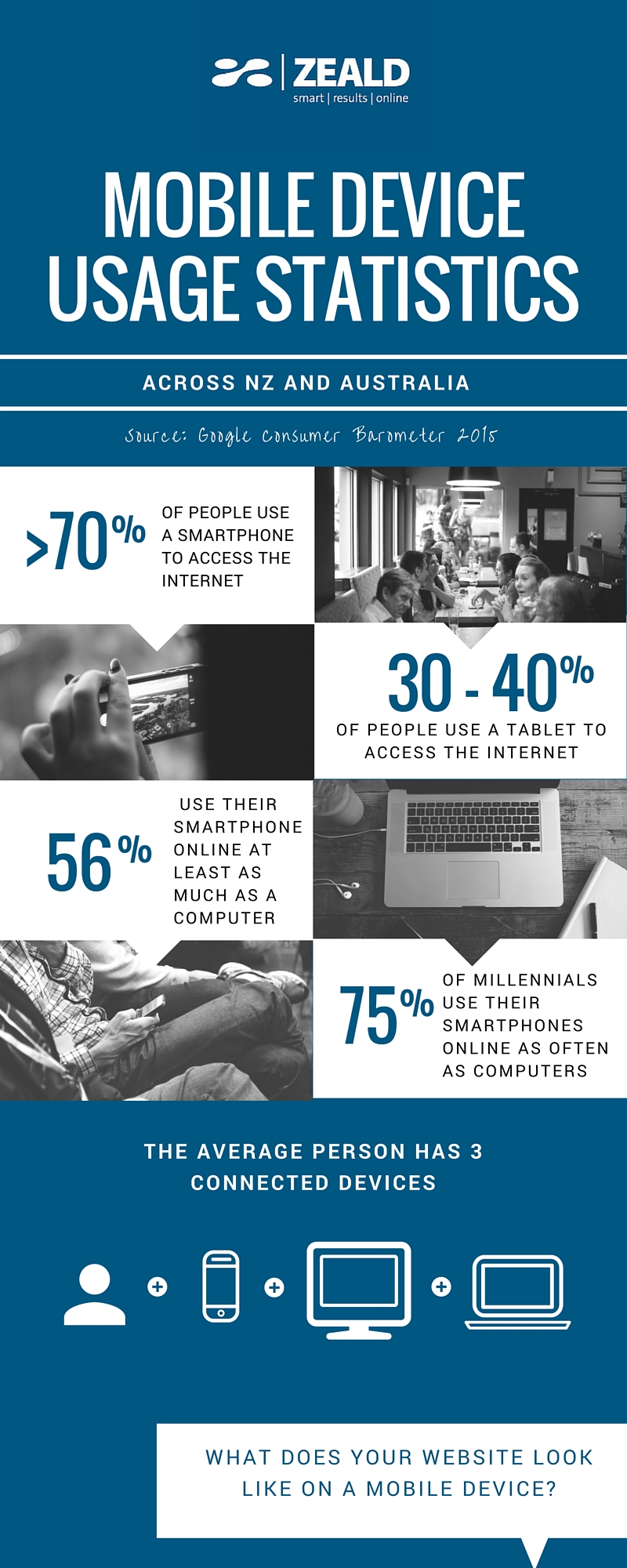
Laptops, tablets, smartphones and hybrids of all three exist, each with their own screen size and resolution. According to Consumer Barometer with Google 2015, more than 70% of Kiwis and Aussies now use a smartphone, and 56% use their smartphone at least as often as a computer.
On average, every person uses 3 different devices to browse the internet. This is usually a computer, a smartphone and a tablet. It’s important then, that your website displays properly on each of these. That’s where responsive design comes in.
Responsive design is a website that can automatically change the way it is displayed, depending on what device is being used to access it. Historically, websites were designed specifically for viewing on a desktop computer and therefore look distorted on other devices. A few years ago, the way around this was to create a completely separate website specifically for mobile users. Now, through the use of complex code, a single website can adapt to any display. It’s a ‘one size fits all’ approach to website design, and is a necessity in this day and age. Google even ranks mobile friendly websites higher in search results.
“You must be shapeless, formless, like water. When you pour water in a cup, it becomes the cup. When you pour water in a bottle, it becomes the bottle. When you pour water in a teapot, it becomes the teapot.” - Bruce Lee
If you aren't sure that your website is displaying correctly on mobile devices, contact us for a free website audit.


Comments